
Smarter by Design.Simpler for Business
Dashboard
What Is Dashboard?
Dashboard is the tab that shows a Backend Service's request, response time, bandwidth, session, queue, connection and health check metrics on a multi-panel monitoring screen with a selectable time range. When a Backend Service's monitoring screen is opened, the Dashboard tab (with the Backend Service's name) comes first.
The screen gathers, in different panels, the total of the traffic coming from all vServices in which the Backend Service is used, the status history and response time of the health check, and the distribution of the traffic among vServices. Each panel can be displayed as a chart, heatmap, table or status timeline; it is updated automatically according to the selected time range. A slowdown or an increase in errors is noticed immediately: at which moment the response time rose, when the health check went down and which vService the load comes from are visible on a single screen.
All monitoring capabilities are a built-in part of TR7: data is collected on the device with per-second resolution and stored in archives of up to 10 years; without the need to install an external analytics or SIEM tool, trends from years ago can be examined retrospectively in addition to real-time monitoring. Archiving is tiered: the finest resolution is kept only for the recent past, and as data ages it is stored summarized in wider steps.
1 s
Per-second data collection
Metrics are collected with per-second resolution; panels are updated automatically according to the selected range
10 Years
Historical data
Statistics are stored in archives of up to 10 years; the time range picker offers preset ranges of up to 5 years
Built-in
No external tool required
All data is collected on the device; no separate analytics/SIEM installation is required
3
View Tabs
Overview, Health Check and Per vService
14
Preset Time Ranges
Preset ranges from 5 minutes to 5 years; also free duration and date range input
8
Core Metrics
Requests, response time, bandwidth, sessions, queue, connection time, connections and response codes
vService
Source breakdown
The same metrics are monitored with separate series for each vService in which the Backend Service is used
32
Panels per tab
At most 32 panels per view tab, at most 16 custom templates per user
Personal
Customizable layout
Templates, adding/moving panels and resizing are stored per user
Accessing Dashboard
- Left Monitor Panel is opened.
- Backend Services is selected from the category tabs at the top left.
- The Backend Services defined on TR7 are listed.
- The Backend Service to be monitored is clicked; the screen opens with the Dashboard tab that carries the Backend Service's name.
Each row in the list carries the Backend Service's Address, Weight, Health (the name of the health check profile), Route Table and Status (SSL, maintenance mode and backup service icons) information. The list is filtered by name, health check status, the SSL Service, Maintenance Mode and Backup Service flags and the route table.
The same screen is also opened in other ways: with the Dashboard button in the header of the preview panel on the right when a Backend Service is selected in the Backend Services list, with the Backend Service row in the Search Bar results, with the Dashboard button of the preview that opens when the Backend Service box in the vService Dashboard diagram is clicked, and by clicking a Backend Service status notification. The dashboard of Backend Groups is described on the Backend Groups Dashboard page.
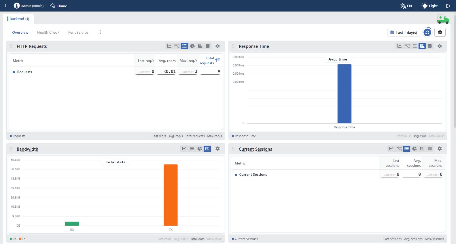 Backend Service Dashboard
Tab Bar
There is a single fixed tab on the screen: Dashboard. The label of the tab is the name of the Backend Service; the colored strip to the left of the name shows the health check status of the Backend Service on this device. If no health check is assigned to the Backend Service, the strip stays colorless. Unlike vService Dashboard, this screen has no Load Balancer Management, Logs & Tracking, Live Stats and Report tabs, and there is no ⋮ menu in the tab bar either.
When the Edit button in the header of the preview panel is clicked, the Backend Service edit form opens on the same screen as a closable Edit tab; when the form is saved, the tab closes. The open tab is written to the address bar and shared by copying the link; this applies only to the fixed Dashboard tab, and the Edit tab is not brought back with the link.
A collapsible panel that summarizes the Backend Service's configuration and health check status is also located on the right side of the screen; for details, see Backend Service Preview.
Backend Service Preview
The preview panel on the right side of the screen summarizes the Backend Service's configuration, its health check status and the vServices in which it is used. The panel carries the same content as the preview that opens when a row is selected in the Backend Services list.
The panel is visible only in the Dashboard tab; when switching to the Edit tab, the edit form's own preview takes its place. The panel is collapsed and expanded by clicking the handle with the ambulance figure outside its left edge. Resizing is done only by dragging from the left edge of the panel; the default width is 400 pixels and the lower limit is 360 pixels; the upper limit is the greater of 600 pixels and 70% of the window width. The handle carries the Backend Service's health check color on this device; if no health check is assigned, it appears gray. The width and collapsed state are remembered per user and are shared with the preview in the Backend Services list. The panel has no close button; it can only be collapsed.
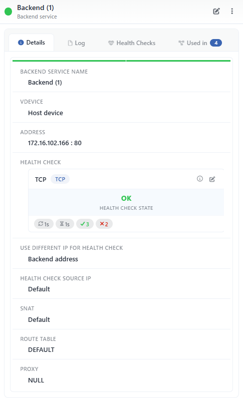 Backend Service Preview
The rows change according to the configuration
The preview is not a fixed form; it is shaped dynamically according to the configuration of the Backend Service. The row of a feature not used in the Backend Service is not shown empty; it is not displayed at all: if backup service, SSL or maintenance mode is not checked, the related rows are not present; if no health check is assigned, the Health Checks tab is not added. The image above shows a Backend Service with a TCP health check assigned and SSL and maintenance mode off.
Panel Header
The header contains the Backend Service's name, the Backend Service caption below the name and a colored status dot showing the health check status: green OK, red Error, orange Preparing (the check result is not yet final), gray HC Disabled and No Data. In cluster setups, the dot is split into two halves; the left half shows the status of this device and the right half that of the peer device. If no health check is assigned to the Backend Service, a gray power icon is displayed instead of the status dot.
At the top right, there are a shortcut and a menu. The shortcut is shown only as an icon; its name appears when the pointer is over it.
| Button | Function |
|---|---|
| Edit | The Backend Service edit form opens as a closable Edit tab. |
The ⋮ menu next to it contains only Log; the records of the Backend Service open in a window. Unlike the vService preview, this header has no tcpdump, Delete, Reload, Enable and Disable operations; the Dashboard button is not shown on this screen either.
Panel Tabs
| Tab | Content |
|---|---|
| Details | The configuration rows and health check card of the Backend Service (tables below). The thin color strip right below the tabs shows the health check status; in a cluster, a separate strip is shown for each device. The Health Check Source IP and SNAT rows whose values differ on the two devices, and the Spoofing, Status Code and DNS Answers rows, are shown in two columns carrying the device names; the other rows are shown in a single column. |
| Log | The Backend Service's audit records (who changed what and when); with date range, record limit (Log Limit), refresh and Excel/CSV export tools. The range and record limit are stored per user; on first opening, the range is the last three years and the limit is 10 records. With a separate icon, the records open in a full-screen log view. |
| Health Checks | Health check result records (Health Checks Tab; for details, the Health Checks page). It is displayed only if a health check is assigned to the Backend Service. |
| Used in | The vServices in which the Backend Service is used. The badge next to the tab name shows the usage count; if the Backend Service is not used anywhere, the tab is not displayed at all. |
Details Rows
The rows in the Details tab are as follows, in order:
| Row | Description | Visibility condition |
|---|---|---|
| Backend Service Name | The name of the Backend Service. | Always |
| vDevice | The device on which the Backend Service is defined; Host Device on the main device. | Always |
| Address | The address of the Backend Service, in the IP : port format. | Always |
| Health Check | The assigned health check profile, as the Health Check Card. If no profile is assigned, a power icon and the No Check text are displayed. | Always |
| Use Different IP for Health Check | The address at which the health check is performed; Backend Address if no separate address is defined. | Always |
| Health Check Source IP | The source IP address of the health check packets; Default if not defined. | Always |
| Backup Service | Shows that the Backend Service is marked as a backup. | If backup service is checked |
| SSL Service | Shows that TLS is used in the connection to the Backend Service. | If SSL is checked |
| Maintenance Mode | Shows that the Backend Service is in maintenance mode. | If maintenance mode is checked |
| SNAT | The source address translation used in the traffic to the Backend Service; Default if not defined. | Always |
| Route Table | The route table the Backend Service is bound to. | Always |
| Proxy | The proxy setting of the Backend Service; NULL is displayed if not defined. | Always |
| Status Code | The HTTP status code received in the last health check. | If the health check type is HTTP or HTTPS |
| DNS Answers | The DNS answers received in the last health check. | If the health check type is DNS |
The other rows not included in the image above (Spoofing, Use Frontend Port, Cookie Content, Connection Limit, Weight) are listed if the related setting is used in the Backend Service.
Health Check Card
If a Health Checks profile is assigned to the Backend Service, the profile's card is shown in the Health Check row:
| Element | Meaning |
|---|---|
| Identity Row | The profile name and the check type badge (e.g. TCP). The profile summary is displayed with the info icon on the right, and the profile edit window opens with the pencil icon. |
| Status Row | The current result of the health check (OK, Error, Preparing) and the Health Check State label below it. In a cluster setup, if the results of the two devices differ, the result of each device is shown in a separate column with the device name. |
| Error Strip | The error text if the check reports an error; in a cluster, it is shown with the device name or in two columns. |
| Setting Badges | The profile's Period (check interval), Timeout, Required Successes (consecutive successful checks needed to be considered up) and Required Failures (consecutive failed checks needed to be considered down) values. |
Health Checks Tab
The Health Checks tab lists the health check results of the Backend Service in chronological order. Each row contains the time, the result (colored status text), the result summary and, in a cluster, the device name; the rows are separated by day headings. When the records are written, the format of the summary text and the details of the enlarge window are described on the Health Checks page.
| Control | Function |
|---|---|
| Date range | The time range of the listed records; the last 24 hours on first opening. |
| Log Limit | The maximum number of records to be listed; 50 on first opening. |
| All Logs / Only Change Logs | Listing all check results or only the records in which the status changed; Only Change Logs on first opening. |
| Refresh | Reloads the records. |
| Enlarge | Opens the records in a large window together with the charts of the Backend Service. |
The range, limit and record type selections are stored per user. When the record type switch is changed, the list is refreshed immediately; after the range or limit is changed, the list is updated with Refresh. While the list is filled, the total number of records and the Last Updated time are located at the bottom. If there are no records in the selected range, the No Logs Found message and a suggestion to widen the range are displayed.
View Levels (Drill-Down)
The Backend Service monitoring view is offered at three levels:
| Level | Scope |
|---|---|
| vService | The Backend tab of the vService Dashboard screen; it shows the distribution in that vService of the Backend Services bound to a single vService. |
| Backend Group | Backend Groups Dashboard; it shows the total of the group and the group members with separate series. |
| Backend Service | The Dashboard of a single selected Backend Service (the screen described on this page). |
This page describes the Dashboard at the Backend Service level; the panels on this screen show the total of the data coming from all vServices in which the Backend Service is used, or its breakdown per vService.
In addition, when a time range is selected by dragging horizontally over the panels, the whole dashboard is locked to that range. Because this selection produces an absolute start/end range, it also stops automatic refresh; to return to a relative range, a preset range is selected from the time range picker.
Screen Controls
Above the panels there is a full-width toolbar that controls all panels together. On the left of the bar are the view tabs and the template menu; on the right are the time range picker, the refresh button and the settings. In the top right corner of each panel, there are view icons specific to that panel.
 Screen Controls
INFO
Menu
The menu at the end of the view tabs contains the operations for the Dashboard tab layouts (templates). When a view tab is double-clicked, that template is returned to its default state; the operation again requires confirmation.
Create New Template
A new empty template (tab layout) is created. In the window that opens, the template is given a name, and the template opens as soon as it is created.
Duplicate Current
A copy of the current template is created; the copy is given a new name. The option is enabled only while a template is open.
Edit Template
The name of the current template is edited. The option is enabled only for templates created by the user; it is inactive for preset templates. The layout is not changed from this window; panels are edited by dragging and resizing them directly.
Reset to Default
The current template is returned to its default state after confirmation is obtained. The option is enabled for templates on which changes have been made and for templates the user created in the same session.
Remove Template
The current template is deleted after confirmation is obtained. The option is enabled only for templates created by the user; preset templates cannot be deleted. When the tab of a user template is clicked with the middle mouse button, the template is also deleted after confirmation is obtained.
Reset All to Defaults
After confirmation is obtained, the dashboard is returned entirely to its default state: the templates created by the user are deleted, the panel changes in preset templates are undone, and the toolbar preferences (time range, automatic refresh, resolution, source, height, theme) return to their default values.
INFO
Last 1 day(s) Time Range
The time period whose data the panels show is selected; the default range is Last 1 day(s). There are fourteen preset ranges, extending from 5 minutes (Last 5 minute(s)) to 5 years (Last 5 year(s)): 5 minutes, 15 minutes, 30 minutes, 1 hour, 3 hours, 12 hours, 1 day, 3 days, 7 days, 1 month, 3 months, 6 months, 1 year and 5 years. Alongside the preset ranges, a free duration (minutes, hours, days, weeks, months, years) is entered with Custom Duration. All panels are updated according to the selected range. The selection made is stored per user and preserved in later sessions. When the screen is opened through the Left Monitor Panel, the duration selected in the panel is transferred to the time range of the dashboard.
An absolute range can also be selected by entering a start and end date in the Custom Date Range section.
An absolute range stops automatic refresh
In ranges selected by entering a start/end date, the panels do not refresh by themselves; the data is refreshed only with the refresh button. In addition, an absolute range is not stored as a user preference; when the screen is reopened, it returns to the relative range.
INFO
Refresh
Reloads the data in the panels instantly; the button becomes inactive while loading is in progress. Automatic refresh is enabled by default and the panels update by themselves every 10 seconds; the remaining time is shown with the progress ring around the button. On refresh, the cache is bypassed and the panels are loaded in sequence in groups of twenty.
INFO
Settings
The Dashboard general view and the display settings of the panels are accessed. The window is divided into three sections: Data (resolution and automatic refresh), Clustering (source selection; only while the cluster is enabled) and Visual (height and theme).
Chart Resolution
The resolution of the charts (data point density) is selected: High Resolution (1,440 points), Standard Resolution (720 points, default) or Low Resolution (360 points). High resolution provides a more detailed display, and low resolution a more performant one.
Auto-Refresh
The automatic refresh interval of the panels is set: Disabled, 5s, 10s, 30s and 60s. The default value is 10 seconds.
Source
In cluster setups, which member's data is shown is selected. The options are this device's name, the peer device's name and Both Devices; the default is Both Devices. This section is displayed only while the cluster is enabled.
Height
The height of the panels on the screen is set.
Theme
The display theme (color scheme) of the charts is selected: Professional (default), Corporate, High Contrast, Monochrome Blue and Colorblind Safe.
INFO
Panel View Icons
With the icons in the top right corner of each panel, the display format of the data is changed. The icons are displayed only if more than one view is offered in the panel; in a panel, only the views suitable for that data are enabled. For example, the status timeline is offered only in the health check status panel, and the pie chart only in panels where summing is meaningful.
| Icon | View | What does it do? |
|---|---|---|
| Line Chart | Shows the metric's change over time (its trend); in multi-series panels it can be drawn stacked. | |
| Bar Chart | Compares the values between series with side-by-side bars. | |
| Pie Chart | Shows the proportional share of the series within the total. | |
| Heatmap | Shows the series as color bands on the time axis; as density increases, the band "heats up". | |
| Stat Table | Lists the series in a sorted table with their summary values (last/average/highest/total); clicking a column header sorts by that column. | |
| Mini Chart | Shows the metric as a compact trend curve (summary card). | |
| Status Timeline | Shows status values as color bands on the time axis. |
The Mini Chart view is added automatically to every single-series panel that offers a line view; multi-series panels do not gain this view.
Panel-specific settings are reached from the panel's icon. Panels are moved by dragging from the handle in their title (not from any part of the card) and resized from their bottom right corner; a new panel is added to the tab with the Add Visualization card at the end of the layout. All layout changes made are stored specifically for the user.
INFO
Panel Metric Columns
Below each panel, the summary statistics of that metric are listed in columns for each series shown:
| Column | Meaning |
|---|---|
| Last value | The last (most recent) value in the selected range |
| Avg. value | The average value over the range |
| Max. value | The highest value in the range |
| Total | The total accumulated over the range |
The unit suffix in the column header changes according to the metric: it is displayed as Total requests and Avg. req/s in request panels, Total connections and Max. con/s in connection panels, Total data in data panels, Avg. sessions and Max. sessions in session panels, and Avg. time in duration panels. The Queue Depth panel carries the general Last value / Avg. value / Max. value columns, and the Health Check State panel carries the Last value / Avg. value columns.
Which summaries are present changes according to the metric type: Total exists only in rate metrics; in gauge panels Last value, Avg. value and Max. value are offered, while in status panels only Last value and Avg. value are present. Which of the existing summaries come enabled by default, however, changes according to the view:
- The Stat Table view lists all of the existing columns.
- The line and bar views show only Total in rate metrics and only Avg. value in gauge metrics.
- The Pie view opens with the Avg. and Total summaries in rate metrics and with the Avg. summary in gauge metrics.
Disabled summaries are enabled by clicking them in the strip below the panel. By clicking the series names in the same strip, individual series are also hidden and shown.
The summary strip does not appear in the line view of multi-series panels
The summary boxes open in the line view only if there are at most six series in the panel. There is no summary box in the heatmap and status timeline views (the status timeline shows the uptime percentage on each row); in the mini chart view, the summary is always visible. For this reason, if the Backend Service is used in more than six vServices, no summary is shown in the line view of the Per vService panels. The bar, pie and table views are not affected by this threshold; the summaries are read from these views. In the line view, in panels that are not stacked and show at most two series, the band of the lowest and highest values is opened with the MIN/MAX badge at the beginning of the legend.
View Tabs
Dashboard contains top tabs that group the panels by topic. By default, the Overview tab comes open; if another tab has been selected before within the same navigation, that tab is remembered. The open tab is written to the address bar.
 View Tabs
| Tab | Visibility Condition | Content |
|---|---|---|
| Overview | Always | The total metrics of the traffic coming from all vServices in which the Backend Service is used. |
| Health Check | Always | The status history and response time of the health check. |
| Per vService | Always | The breakdown of the same metrics with separate series for each vService in which the Backend Service is used. |
The panels in these tabs have not been selected manually; each tab shows all panels of the related metric group in the defined order and with their default views. In addition to these, the Backend Group dashboard has a Per Backend Service tab that shows the group members with separate series.
A tab being visible does not mean that data is produced
A view tab and the panels in it are displayed even if no data is produced for that Backend Service. The Overview panels are not filtered by the vService types in which the Backend Service is used: if the Backend Service is used only in L7 TCP vServices, the HTTP Requests and HTTP Response Codes panels are located in the layout but stay empty. The panels in the Health Check tab are also created even if no health check is assigned to the Backend Service. In the Per vService tab, on the other hand, the panels have a condition: if the Backend Service is not used in any vService, only the Add Visualization card remains in the tab.
Overview Tab
The Overview tab contains eight panels that total the traffic coming from all vServices in which the Backend Service is used. Rate and counter metrics are summed across vServices; in the Response Time and Connect Time panels, on the other hand, the highest value among the vServices is shown. Which panels produce data depends on the vService type in which the Backend Service is used: the request and response code panels are fed only from HTTP vServices, the session, queue and connection time panels from HTTP and L7 TCP vServices, the response time panel only from HTTP vServices, and the bandwidth and connection panels from all three vService types.
HTTP Requests
Shows the total HTTP request rate sent to the Backend Service (Requests series). In the table view, the rows are sorted in descending order by the Total requests column by default. The panel receives data only from the HTTP vServices in which the Backend Service is used.
Response Time
Shows the response time of the Backend Service in milliseconds (Response Time series). If the Backend Service is used in more than one vService, the value in the slowest vService is shown. Avg. time is printed as the summary. In cluster setups, the value of each device is drawn separately in the line and heatmap views and averaged in the table and bar views. Response time is measured only in HTTP vServices; in L7 TCP vServices, this panel produces no data.
Bandwidth
Shows the amount of data passing through the Backend Service in two series: RX and TX. In the line view, the series are drawn stacked. Total data is printed as the summary for each series. The panel receives data from all three vService types.
Current Sessions
Shows the number of sessions currently open on the Backend Service (Current Sessions series). In the table view, the Last sessions, Avg. sessions and Max. sessions columns are listed. The panel receives data from HTTP and L7 TCP vServices.
Queue Depth
Shows the number of requests queued for the Backend Service (Queue Depth series). A growing queue means that the service is hitting its concurrency limit. The panel receives data from HTTP and L7 TCP vServices.
Connect Time
Shows the time to establish a connection to the Backend Service (Connect Time series). A rise in this time points more to the network path in between than to the service itself. If the Backend Service is used in more than one vService, the highest value is shown; the cluster behavior is the same as the Response Time panel. The panel receives data from HTTP and L7 TCP vServices.
Connections
Shows the number of connections opened to the Backend Service per second (Connections series). Total connections is printed as the summary. The panel receives data from all three vService types; in L7 TCP and Network vServices, which have no request counter, the load size is read from this panel.
HTTP Response Codes
Shows the distribution of the responses returned from the Backend Service by HTTP status code class in six series. Whether the error originates from the Backend Service itself is read from this panel; for the responses the vService returns to the client, vService Dashboard is used.
| Series | Meaning |
|---|---|
| 2xx | Successful responses. In a healthy Backend Service, this series makes up most of the value. |
| 3xx | Redirect responses. |
| 4xx | Client-side errors. |
| 5xx | Server-side errors. |
| 1xx | Informational responses; seen in protocol upgrade traffic. |
| Other | Responses that fall into none of the classes above. This series is not listed in the table view. |
In the pie view, the distribution is shown as a percentage. The panel receives data only from the HTTP vServices in which the Backend Service is used.
Health Check Tab
The Health Check tab shows the status history and response time of the health check assigned to the Backend Service. The data is collected not through the vService but from the health check itself; for this reason, a single series is drawn even if the Backend Service is used in more than one vService. The settings of the check are located in the Health Checks profile and the result records in the preview's Health Checks Tab, and they are described in detail on the Health Checks page.
Health Check State
Shows the result of the health check as color bands on the time axis (State series): Up indicates that the service is up, and Down that it is down. If the status changed in the selected range, intermediate values are displayed as a percentage such as 50% Up; this shows for how much of the range the service stayed up. In the default status timeline view, instead of a summary box, each row has a percentage badge showing the uptime ratio in the selected range; in the other views, Last value and Avg. value are offered as the summary. In cluster setups, the result of each device is drawn separately in the timeline and line views and averaged in the table view.
Health Check Time
Shows the response time of the health check in milliseconds (Response Time series). In the table and mini chart views, the values are shown with threshold coloring: green up to 100 ms, the info color from 100 ms, the warning color from 200 ms and the danger color from 500 ms; the colors blend gradually between the thresholds. A climbing check time gives a warning before the service goes down. The cluster behavior is the same as the Health Check State panel.
Per vService Tab
The Per vService tab shows the eight metrics in the Overview tab with a separate series for each vService in which the Backend Service is used. The series name is the name of the vService; if the Backend Service is used in a conditional Backend Service branch of a vService, the condition of the branch is shown in parentheses next to the name (e.g. web-vservice (Path = /api)). In this way, which vService the load or slowdown on the Backend Service comes from is distinguished.
Each panel is created only if the Backend Service is used in at least one vService of the type for which the panel produces data, and the panel contains only the series of vServices of that type; for example, the Response Time per vService panel contains only HTTP vService series. The default views and summaries of the panels are the same as their counterparts in the Overview tab.
HTTP Requests per vService
HTTP request rate per vService. It is created if the Backend Service is used in at least one HTTP vService. See HTTP Requests.
Response Time per vService
Response time per vService. It is created if the Backend Service is used in at least one HTTP vService. See Response Time.
Bandwidth per vService
The RX and TX data amount per vService; the series are labeled in the <vService name> / RX format. It is created if the Backend Service is used in a vService of any type. See Bandwidth.
Sessions per vService
The number of open sessions per vService. It is created if the Backend Service is used in a vService of any type; the series belonging to Network vServices receive no data. See Current Sessions.
Queue per vService
The number of queued requests per vService. It is created if the Backend Service is used in at least one HTTP or L7 TCP vService. See Queue Depth.
Connect Time per vService
The connection establishment time per vService. It is created if the Backend Service is used in at least one HTTP or L7 TCP vService. See Connect Time.
Connections per vService
The number of connections opened per second per vService. It is created if the Backend Service is used in a vService of any type. See Connections.
HTTP Response Codes per vService
The HTTP response code classes per vService; the series are labeled in the <vService name> / 2xx format. It is created if the Backend Service is used in at least one HTTP vService. See HTTP Response Codes.
The number of series grows quickly
In the multi-series panels in this tab, the number of series equals the number of vServices multiplied by the number of series kinds: two series per vService are drawn in the Bandwidth per vService panel and six in the HTTP Response Codes per vService panel. When the number of series exceeds six, the summary boxes are not shown in the line view. For this reason, in the Connect Time per vService and Connections per vService panels, which open in the line view by default, the summaries also disappear in the default view; the bar and table views are not affected by this threshold.
Scope and Limits
INFO
- Access to the dashboard and the charts require Load Balancer permission. On a user with only WAF permission, the screen does not open. The tabs do not differ by permission.
- Layout settings do not differ per Backend Service. Adding, moving and resizing panels, templates and toolbar preferences are stored in a single place per user; an edit made in one Backend Service is visible in all Backend Service and Backend Group dashboards. This layout is separate from the layout of vService dashboards.
- At most 32 panels per tab and at most 16 custom templates per user can be created. When the limit is reached, a warning is displayed.
- The saved layout is reset when the dashboard storage format changes. When a version update changes the dashboard storage format, the stored templates, panel layout and toolbar preferences return to their defaults; this does not happen with every update.
- The open tab is written to the address line. The view tab selection is preserved within the same navigation; when re-entering from another screen, it returns to the first template. If tab information is carried in the address line (a shared link or switching to another Backend Service), this information takes precedence over the remembered selection and that tab opens; if that tab does not exist in the opened record, the remembered tab opens, and if that does not exist either, the first tab opens.
- Reset and delete operations require confirmation. Each of the template reset, template delete and full dashboard reset operations shows a separate confirmation window.
- Data is collected from the vServices in which the Backend Service is used. If the Backend Service is not bound to a vService, the traffic panels receive no data; only the health check panels are fed.
- Fine-resolution history is 14 days. The traffic and health check panels go back 14 days at minute resolution; older periods are kept for up to 10 years, summarized in wider steps.
- Panel operations. The gear menu in the top right corner of each panel contains two operations: Edit (the panel's metric, view type, height and width) and Remove (removing the panel from the dashboard). By dragging from the handle in the bottom right corner of the panel, the panel is resized; during dragging, the target size is shown with a ghost frame and a badge in the
1 × 0.5format. When the panel height drops below a full card, the title and summary strip are hidden; they are displayed again when hovered over.