
Smarter by Design.Simpler for Business
Dashboard
What Is Dashboard?
Dashboard is the tab that shows the live attack and inspection traffic, the attack category/OWASP breakdowns and the learning progress of a vService whose WAF protection is enabled on a multi-panel monitoring screen with a selectable time range. When the management screen of a WAF-protected vService is opened, the Dashboard tab (with the name of the vService) comes first.
The screen collects data such as the blocked and detected attack requests, the distribution of the WAF inspection results, the category/OWASP/country-based breakdown of the attacks and the learning coverage metrics in different panels. Every panel can be displayed in the form of a map, a chart, a heatmap or a counter; it is updated automatically according to the selected time range. An attack wave is noticed instantly: from which country it comes, which category it falls into and how much of it WAF has stopped are seen on a single screen.
All the monitoring and reporting capabilities are a built-in part of TR7: the data is collected on the device with a resolution of one second and is kept in archives that go up to 10 years; without the need to install an external analytics or SIEM tool, besides the instant monitoring, the trends of years ago can also be examined retrospectively. The archiving is tiered: the finest resolution is kept only for the near past, and as the data gets older it is summarized with wider steps and kept. The WAF panel and the basic reporting come together with the TR7 WAAP product license; the scope of the reporting is extended with the L7 Reporting add-on.
1 s
Per-second data collection
Metrics are collected with per-second resolution; panels are updated automatically according to the selected range
10 Years
Historical data
Statistics are stored in archives of up to 10 years; the time range picker offers preset ranges of up to 5 years
Included
Basic Reporting
The basic reporting comes with the product license; the L7 Reporting add-on extends the reporting to more vServices
Built-in
No external tool required
All data is collected on the device; no separate analytics/SIEM installation is required
3
View Tabs
Summary, Attack Analysis and (if the learning is enabled) Learning
56
Attack Breakdown
35+ attack categories + OWASP Top 10 (Web) + OWASP API Top 10 panels
250+
Country Breakdown
The attacks are monitored live on a world map according to the source country
Personal
Customizable layout
Templates, adding/moving panels and resizing are stored per user
One Click
Transition to deep analysis
The detailed WAF Report is produced with a single click by inheriting the selected time range
Accessing Dashboard
- Left Monitor Panel is opened.
- WAF-Protected vServices is selected from the category tabs at the top left.
- The vServices defined on TR7 with WAF protection enabled are listed.
- The vService to be monitored is clicked; the screen opens with the Dashboard tab that carries the vService's name.
In the list, every row carries the WAF Mode and OWASP Protection Level information of the vService; the primary metric of the row is WAF Blocked Requests. The list is listed in ascending order by the vService name by default; sorting by the metric is selected from the view settings.
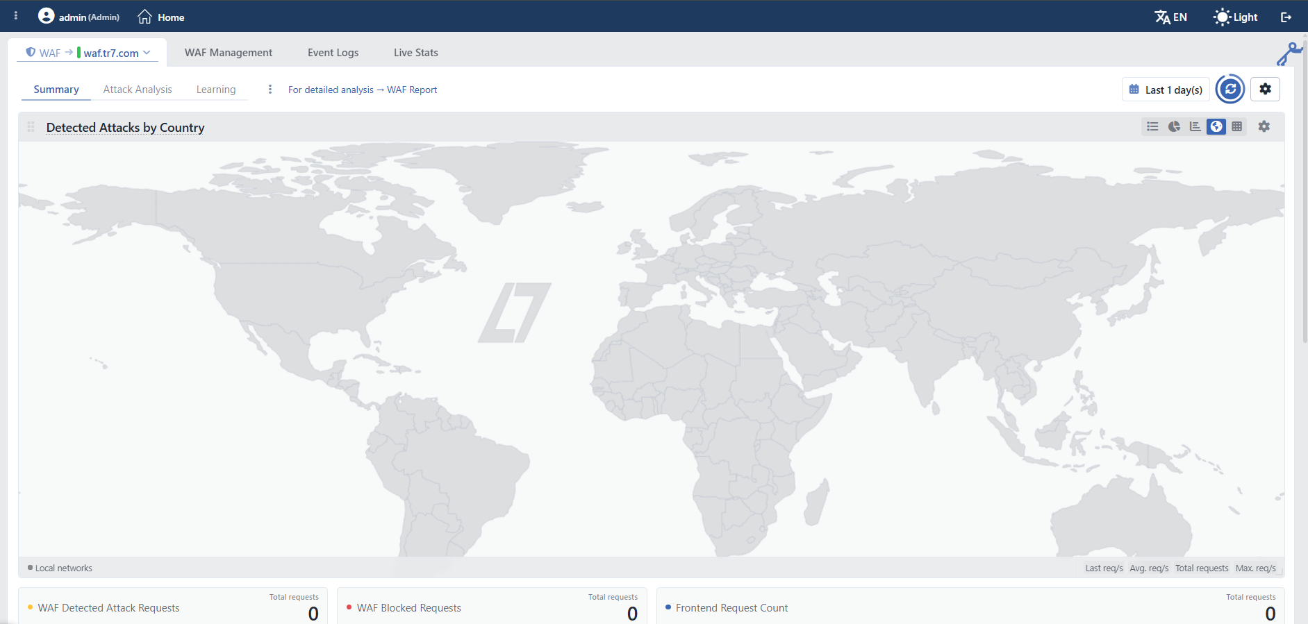 WAF Dashboard
Tab Bar
Next to the Dashboard tab, the WAF Management, Event Logs, Live Stats and (if AI or Teacher learning is enabled on the vService) AI Learning & Teacher Tracking tabs are located on the same screen. The name of the learning monitoring tab changes according to the learning form that is enabled: if only the artificial intelligence learning is enabled it appears as AI Learning Tracking, if only the teacher learning is enabled as Teacher Tracking, and if the two are enabled together as AI Learning & Teacher Tracking.
On the right side of the screen there is also a collapsible panel that summarizes the WAF configuration of the vService as a request flow diagram; for its detail see WAF - WAAP Data Flow Panel.
WAF - WAAP Data Flow Panel
The preview panel on the right side of the screen summarizes the WAF configuration of the vService as a request flow diagram. The panel has no separate title in the interface; in this document it is described under the name WAF - WAAP Data Flow Panel so that it can be referred to easily. For an introduction to the panel, see WAF - WAAP Data Flow Panel. In the diagram, the path the traffic follows from entering at the listener addresses, through the inspections in the WAF layer, until it reaches the Backend Services is seen at a glance, together with the enabled learning and whitelist paths. Every element in the diagram reflects the live configuration; with the gear icons on the elements, the related WAF setting is gone to directly.
The panel is visible only on the Dashboard and WAF Management tabs. It is collapsed and expanded by clicking the handle figure outside the left of the panel; when it is hovered over, the figure shows the opposite operation. Resizing is done only by dragging from the left edge of the panel. The width and the collapsed state are remembered per user. The panel has no close button; it can only be collapsed.
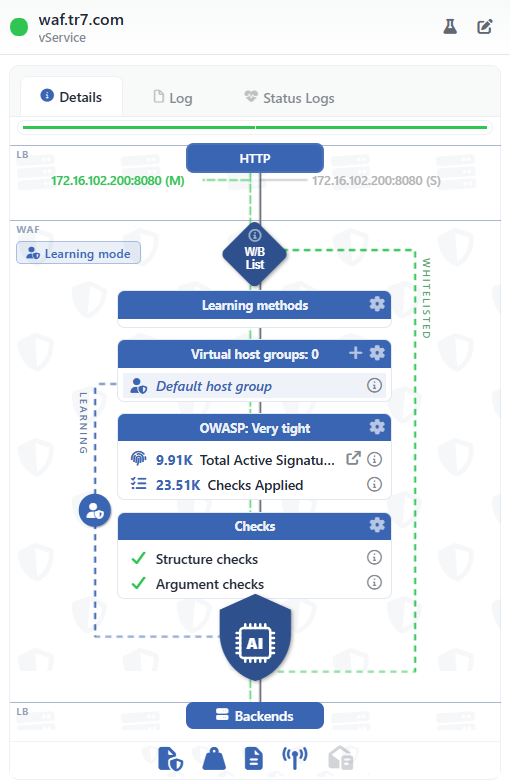 WAF - WAAP Data Flow Panel
The diagram is dynamic
The WAF - WAAP Data Flow Panel is not a fixed image; it is shaped dynamically according to the WAF configuration made on the vService. Which cards and rows are listed, which flow paths (WHITELISTED, LEARNING) are displayed and the appearance of the mode badge and the decision node result strips depend entirely on the current settings: for example, if no whitelist is defined, the WHITELISTED path is not displayed at all, a learning method that is off is not listed in the Learning Methods card, and as the mode of the host groups changes, the badge and the strips change as well.
The image above shows an example vService working in the Learning mode; the explanations on this page cover all the elements that can appear in the diagram and under which condition they appear. The diagram on the screen can be different from this example according to the configuration of the vService.
Panel Header
In the title, the name of the vService, the subtitle vService below the name and the colored status dot that shows the combined status are located: green OK, red Error, orange Warning, blue Evaluating, gray Disabled. In cluster setups the dot is in two halves; the left half shows the status of this device and the right half that of the peer device.
At the top right there are two shortcuts. Both are displayed as icons only; their names appear when they are hovered over. Analyze is displayed on the users who have the WAF authorization and Edit on the users who have the change authorization in the WAF area.
| Button | Function |
|---|---|
| Analyze | A closable Analyze tab opens on the same screen; the learned page types are analyzed. |
| Edit | It is passed to the WAF Management tab. |
Panel Tabs
| Tab | Content |
|---|---|
| Details | The status strip, the configuration warnings, the device-based status messages and the flow diagram below them. If there is a configuration that has been withdrawn from use, a warning row is also displayed; the status messages are shown at most four rows per device, the rest are behind an expand row. The thin color strip right below the tabs shows the combined status of the vService on that device (green = OK); in a cluster a separate strip is displayed for every member. |
| Log | The WAF-labeled ones of the audit (who changed what and when) records of the vService; with the date range, the record limit, the refresh and the Excel/CSV export tools. With a separate icon the records are opened in the full screen log view. |
| Status Logs | The status transition history of the vService; every transition is listed with the "old status → new status" badges and a reason row. It is filtered with the date range and the limit selection, and there is a refresh button. The encrypted support package rows produced for diagnostic purposes also appear here and can be downloaded. |
Flow Diagram: LB Section
The upper part of the diagram is marked with the LB strip and shows the entry layer of the vService:
| Element | Meaning |
|---|---|
| Type Node | The blue node at the very top shows the type of the vService: HTTP, L7 TCP or, in the Network type, together with the protocol suffix, Network (TCP - L4), Network (UDP - L4) or Network (ANY - L3). |
| Listener Rows | Every row is a listener address (IP:port). In cluster setups the left side of the row shows the instance on this device and the right side the instance on the peer device; on cluster (VIP) type IPs, (M) indicates the master and (S) the slave instance. The color is the operating status of the address on that device: green = active, light gray = waiting in backup, dark gray = down (the interface or the server is down), orange = warning (no carrier signal, the master could not be found, a possible address conflict), red = problematic. The addresses that have been turned off manually are also shown struck through. When the address is clicked, the IP detail window opens; with the copy icon in the row, the address is taken to the clipboard. |
| SSL Badges | On the listeners on which SSL termination is done (Terminate SSL / SSL HTTP/2.0), the SSL badge is displayed next to the address; on the listeners on which QUIC (HTTP/3) is enabled, h3 is added next to the badge. On the listeners that redirect from HTTP to HTTPS, on the other hand, the circular arrow shaped Redirect SSL mark is shown. |
The Flow Diagram: The WAF Section
The WAF strip contains the path the traffic follows in the WAF layer and the inspection cards. The badge at the beginning of the strip shows the WAF mode of the vService if all the host groups work in the same mode: Learning Mode (blue), Monitor Mode (orange) or Blocking Mode (red); if the modes are mixed, the badge is not displayed.
| Element | Meaning |
|---|---|
| W/B List | The entrance gate to WAF: the diamond node that represents the Whitelist & Blacklist configuration. With the info icon, the summary of the whitelist/blacklist settings is displayed. The traffic that complies with the whitelist is separated from this node to the WHITELISTED path on the right. |
| Learning Methods | The card that lists the enabled Learning Methods; the possible rows are Conditional Learning, Teacher and AI Learning, and only the enabled ones are visible. |
| Virtual Host Groups: N | The card that lists the Virtual Host Groups of the vService; the number in the title is the number of groups other than the default group. A new host group is added with +, and the group list is edited with the gear. The rows show the named groups first and the Default Host Group at the very bottom; the icon of every row reflects the mode of that group. If the number of groups is more than four, the card is collapsed: an expand/collapse mark comes to the title and only the first four groups are listed. |
OWASP: <level> | The card that shows the enabled OWASP Protection Level in the title (Aggressive, Very Tight, Tight, Normal or Elementary). The Total Active Signatures row shows the number of signatures enabled at this level; with the arrow icon next to it, the OWASP rule list tab is opened. The Checks Applied row is the number of inspections actually applied to the engine; with the info icon, its breakdown according to the request region is displayed. This row is displayed only if the inspection count has been produced for the vService; if it has not been produced yet, a single row remains in the card. |
| Checks | The card that shows the status of the basic inspections: the Structure Checks and Argument Checks rows are listed with a green check if they are enabled and with a cross mark if they are off. |
The Flow Diagram: The Decision Node and the Flow Paths
| Element | Meaning |
|---|---|
| AI Node | The shield shaped AI node below the inspection cards is the decision point of WAF: every request that passes through the inspections is concluded here. Below the node, according to the configuration, at most three result icons appear: on the left the red Blocked (the blocked requests; their path ends here), in the middle Clean (the clean traffic; it continues to the Backend Services), on the right the orange Monitor and/or Teacher (the traffic that is not blocked but monitored). The two results at the sides are separated from the main line with a dashed strip each; Clean is not a separate strip, its icon stands directly on the main line. The strip of the monitored traffic joins the main line again with a green return line. Which results will be displayed depends on the modes of the host groups and on whether the teacher learning is enabled. |
| The WHITELISTED Path | It is the green dashed path that is displayed when the whitelist is configured and that flows from the right edge; it shows that the traffic that complies with the whitelist skips all the WAF inspections and connects to the part after the decision node. |
| The LEARNING Path | It is the blue dashed path that is displayed while the conditional learning is enabled or while a host group is in the Learning mode and that flows from the left edge; it shows that the traffic within the learning scope flows not to the inspection cards but directly to the decision node. On a vService that only learns (and has no teacher), no result icon is displayed below the decision node; the node appears only as the shield badge and the main line continues without interruption. |
| Backends | The node at the end of the diagram represents the Backend Services that the clean traffic reaches. |
Bottom Settings Strip
The icon strip below the diagram represents the WAF settings that are not located on the traffic path. When an icon is clicked, the summary card of the related section opens and the setting is gone to with the pencil icon. The dimmed appearance works only on the Periodic Reporting icon: while the e-mail report is off, this icon fades. The other four icons stay colored even if the related setting is completely off; it cannot be understood from the appearance of the strip whether a section is on or not.
| Icon | Section |
|---|---|
| Blocking Page | |
| Request Body Limits | |
| Log Settings | |
| SIEM & Attack Details | |
| Periodic Reporting |
View Levels (Drill-Down)
The WAF monitoring view is offered at two levels:
| Level | Scope |
|---|---|
| All the vServices | The WAF tab on the Home screen of the device; it shows the collective panels (with the All vServices - prefix) that cover all the WAF-protected vServices and the vService-based breakdown of the blocked requests. See Home Dashboard: WAF. |
| vService | The Dashboard of a single selected WAF-protected vService (the screen explained on this page). |
This page describes the Dashboard at the vService level; the panels on this screen show only the selected vService's data.
Screen Controls
Above the panels there is a full-width toolbar that controls all the panels together. On the left of the bar, the view tabs, the template menu and the WAF Report shortcut; on its right, the time range selector, the refresh button and the settings are located. In the top right corner of every panel, on the other hand, the view icons specific to that panel are located.
 Screen Controls
INFO
Menu
The menu on the left of the toolbar contains the operations for the Dashboard tab layouts (the template).
Create New Template
A new empty template (tab layout) is created.
Duplicate Current
A copy of the current template is created.
Edit Template
The name of the current template is edited. The option is enabled only on the templates created by the user themselves; it is passive on the ready templates (Summary, Attack Analysis, Learning). The layout is not changed from this window; the panels are arranged by being dragged and resized directly.
Reset to Default
The current template is returned to its default state after confirmation is obtained. The option is enabled only for templates on which changes have been made.
Remove Template
The current template is deleted after the confirmation is received. The option is enabled only on the templates created by the user themselves; the ready templates cannot be deleted. If the deleted template is open at that moment, the first template is returned to.
Reset All to Defaults
After confirmation is obtained, the dashboard is returned entirely to its default state: the templates created by the user are deleted, the panel changes in preset templates are undone, and the toolbar preferences (time range, automatic refresh, resolution, source, height, theme) return to their default values.
INFO
For Detailed Analysis → WAF Report
Next to the menu there is a shortcut specific to the WAF Dashboard: For Detailed Analysis → WAF Report. When it is clicked, a closable WAF Report tab opens on the same screen and the time range selected on the Dashboard is handed over to this tab. The handover works only for the relative ranges and only while the tab is newly opening: a range selected by entering a start/end date is not transferred, and a report tab that is already open preserves its own range. When the range is not transferred, the report opens with Last 1 day(s).
The report collects the WAF activity of the selected period in a single document as HTML, PDF or XLSX. The form fields, the HTML report with six views and the output structures are explained on the WAF Report page.
The same tab is also opened with the Generate Report button located in the Periodic Reporting card on the WAF Management tab. Its version that covers all the vServices is on the Global WAF Report page and the scheduled e-mail reports are on the Periodic Reporting page.
INFO
Last 1 day(s) Time Range
Which time slice the panels will show the data of is selected; the default range is Last 1 day(s). The preset ranges extend from 5 minutes (Last 5 minute(s)) to 5 years (Last 5 year(s)). All the panels are updated according to the selected range. The selection made is stored per user and is preserved in the following sessions.
INFO
Refresh
Reloads the data in the panels instantly. The automatic refresh is on by default and the panels are updated by themselves every 10 seconds; the remaining time is shown with the progress ring around the button.
INFO
Settings
The Dashboard general view and the display settings of the panels are accessed. The window is divided into three sections: Data (resolution and automatic refresh), Clustering (source selection; only while the cluster is enabled) and Visual (height and theme).
Chart Resolution
The resolution of the charts (data point density) is selected: High Resolution (1,440 points), Standard Resolution (720 points, default) or Low Resolution (360 points). High resolution provides a more detailed display, and low resolution a more performant one.
Auto-Refresh
The interval at which the panels are refreshed by themselves is set; the default value is 10 seconds and the automatic refresh can be turned off by selecting Disabled.
Source
In cluster setups, which member's data is shown is selected. The options are this device's name, the peer device's name and Both Devices; the default is Both Devices. This section is displayed only while the cluster is enabled.
Height
The height of the panels on the screen is set.
Theme
The display theme (color scheme) of the charts is selected: Professional (default), Corporate, High Contrast, Monochrome Blue and Colorblind Safe.
INFO
Panel View Icons
With the icons in the top right corner of every panel, the display form of the data is changed. In a panel only the views suitable for that data are enabled; for example, the map is offered only for the geographic distribution panel and the gauge only for the percentage panel.
| Icon | View | What does it do? |
|---|---|---|
| Map | Shows the geographic distribution on a world map; the density is colored on a country basis. | |
| Line Chart | Shows the metric's change over time (its trend); in multi-series panels it can be drawn stacked. | |
| Bar Chart | Compares the values between series with side-by-side bars. | |
| Pie Chart | Shows the proportional share of the series within the total. | |
| Heatmap | Shows the series as color bands on the time axis; as density increases, the band "heats up". | |
| Stat Table | Lists the series with their summary values (last/average/highest/total) in an ordered table. | |
| Arc Gauge | Highlights a single percentage/ratio value with an arc-shaped gauge. | |
| 7:10 | Digital | Emphasizes a single summary value with large figures. |
| Mini Chart | Shows the metric as a compact trend curve (summary card). |
The settings specific to the related panel are reached from the icon of the panel. The panels can be moved and resized with drag and drop; a new panel is added to the tab with the Add Visualization card at the end of the layout. All the layout changes made are stored specifically for the user.
INFO
Panel Metric Columns
Below each panel, the summary statistics of that metric are listed in columns for each series shown:
| Column | Meaning |
|---|---|
| Last | The last (most current) value in the selected range |
| Avg. | The average value throughout the range |
| Max. | The highest value in the range |
| Total | The total accumulated over the range |
The unit suffix in the column title changes according to the metric: req/s is used in the request panels (e.g. Last req/s, Total requests).
All four summaries are ready in every panel; which of them come open by default changes according to the view:
- The Stat Table view lists all four columns.
- The line and bar views show only Total.
- The pie view of the taxonomy distribution panels (Detected Attacks by Category, the two OWASP panels, Detected Attacks by Country, Learning Log Sampling) also shows only Total. In contrast, in the pie view of the WAF Inspection Distribution panel, Avg. and Total come open together.
- In the map view all four summaries are open.
- In the percentage panel (Learning Coverage), since the total is not meaningful, there is no Total; in the line view only Avg. is open by default, and Last and Max. are opened over the panel.
Disabled summaries are enabled by clicking them in the strip below the panel. By clicking the series names in the same strip, individual series are also hidden and shown.
In the panels with many series the summary strip does not appear at all
The summary boxes are opened only if there are at most six series in the panel. For this reason, no summary is shown in the line view of the Detected Attacks by Category (36 series) and Detected Attacks by Country (more than 250 series) panels; in these panels the summaries are read from the table and map views.
View Tabs
The Dashboard contains upper tabs that group the panels according to their subjects. The Summary tab comes open by default; if another tab has been selected before within the same navigation, that tab is remembered.
 View Tabs
| Tab | Content |
|---|---|
| Summary | The basic panels that summarize the WAF status of the vService. |
| Attack Analysis | The detailed category, OWASP and country based breakdown of the attacks. |
| Learning | The learning coverage and sampling metrics. This tab is visible only while the learning (smart sampling) is enabled on the vService. |
The same panel can be located in more than one tab; below, each panel is described in detail only in the tab where it first appears, and its repetitions are linked to the related description.
Summary Tab
The Summary tab collects the basic panels that summarize the WAF status of the vService.
Detected Attacks by Country
Shows the country distribution of the detected attack requests according to the geographic location of the source IP on a world map. The attack definition of this panel is not exactly the same as that of the WAF Detected Attack Requests panel: here, besides the blocked requests, the requests that are caught by a monitored rule are also counted. For this reason, a request that is caught only by a monitored rule appears on the map but is counted as Clean in the inspection distribution. Every series corresponds to a country; the attacks coming from the local and private networks are collected in the Local Networks series and this series is always shown even if its value is zero. The map colors the attack density with a threat gradient extending from yellow to red; the countries that have no attack record are not shown. It is possible to switch between the map, heatmap, table, bar and pie views.
WAF Detected Attack Requests
Shows the total rate of the requests that WAF has detected as an attack. The Attacks series is the sum of the blocked (Blocked), monitored (Monitor) and teacher traffic (Teacher) attack requests. The learning (Learning) traffic is not included in this count.
WAF Blocked Requests
Shows the rate of the requests that are actually blocked by WAF (the Blocked series): the requests whose attack score reaches the blocking threshold and that fall to a host group in the blocking mode. The requests that are detected but passed within the Monitor/Teacher scope are reflected not in this panel but in the WAF Detected Attack Requests panel.
Frontend Request Count
Shows the total HTTP request rate coming to the vService (the Requests series). It is the same data as the total request counter on the Load Balancer side; it is also located on the WAF Dashboard so that the size of the attack rates relative to the total traffic can be evaluated.
WAF Inspection Distribution
Shows the distribution of how WAF concludes every incoming request in six series. What a vService working in the Monitor or Learning mode actually does is read from this panel:
| Series | Meaning |
|---|---|
| Whitelisted | The requests that do not enter the WAF inspection at all because they comply with the skipping conditions. Since the static content exemption, which is on by default, is also written to this series, on the sites with a static weight the greater part of the series consists not of the whitelist but of the static file requests. |
| Clean | The requests that are inspected and for which no attack finding is reported. |
| Blocked | The requests that are inspected and blocked. |
| Monitor | The requests for which a blocking decision is made in a host group in the Monitor mode but that are not blocked and are only monitored. |
| Teacher | The requests that come with the teacher identity (IP address, header or cookie) and for which a blocking decision is made but that are passed for the purpose of a false positive check / teaching. |
| Learning | The requests within the learning scope: the traffic that falls to a host group in the Learning mode or that complies with the Conditional Learning conditions. The learning traffic is counted in this series even if it receives an attack score. |
A request is counted in only a single series; the order is timeouted → whitelisted → learning → fpc (Teacher) → monitor → blocked → clean and the first one that fits wins. For this reason, the teacher traffic that also enters the learning scope is counted as Learning, not Teacher.
The first link of the chain, timeouted (the requests that have entered the WAF inspection but whose scanning could not be completed), is not shown in this panel at all; the sum of the six series may not give the whole of the inspected traffic.
Besides the stacked line view, it is possible to switch to the bar, table and pie (with the percentage shares written) views.
Detected Attacks by Category
Shows the breakdown of the detected attacks according to the attack categories. The category list consists of the attack categories in the signature database (e.g. Access Control Bypass, Application DoS, Authentication Bypass, SQL Injection, Cross-Site Scripting, Directory/Path Traversal ...) and the structural categories added to them (Structure Limits, Structure Policies, Content Integrity, IP Reputation); every series is a category. The heatmap view draws only the 15 densest categories; the table, bar, pie and line views list all of the 36 defined categories and the ones that have not produced a record in that period appear with a zero value. The default view of the panel itself is the table that sorts the categories according to their totals; on the Summary tab, on the other hand, it is placed as a bar chart. It is also possible to switch to the stacked line, heatmap and pie views.
The category totals are not the number of requests
A single request can fall into more than one attack category at the same time. For this reason, the sum of the series in this panel does not have to be equal to the number of attack requests; the panel shows not the number of requests but the category-based detection density.
Attack Analysis Tab
The Attack Analysis tab examines the attacks in detail on a category, OWASP classification and country basis.
The repeated panels located in this tab (their descriptions are in the Summary tab):
- Detected Attacks by Country: it is located as two separate panels, with both the map and the summary table views. See Detected Attacks by Country.
- Detected Attacks by Category: it is located with both the summary table and the heatmap views. The heatmap shows the 15 densest categories as color bands on the time axis; the attack campaigns that show continuity are easily distinguished as "hot bands". See Detected Attacks by Category.
Detected Attacks by OWASP Top 10 (Web)
Shows the distribution of the detected attacks according to the OWASP Top 10 (2021) web categories. The ten series are labeled with the identity and the name together in the form A01:2021 · Broken Access Control; in the pie slices the short label (e.g. A03:2021) is used. If a signature is related to more than one OWASP item, its detection is reflected separately in every item it carries.
Detected Attacks by OWASP API Top 10
Shows the distribution of the detected attacks according to the OWASP API Security Top 10 (2023) categories; the ten series are labeled with the identities API1:2023 – API10:2023. Its behavior is the same as that of the Detected Attacks by OWASP Top 10 (Web) panel.
Learning Tab
The Learning tab is visible while the learning (smart sampling) is enabled on the vService and has the progress of the learning monitored with four panels; these panels are produced from three chart definitions (the coverage percentage is drawn both as a gauge and as a line). For the tab to be visible, the vService has to be of the HTTP type, the smart sampling must not have been turned off and the teacher has to be on or at least one host group has to be in the Learning mode. The request shape mentioned in these panels is the structural pattern that defines the method, the domain name, the path, the names of the query parameters, the body keys, the header names and the matching signatures of a request together; the learning is built on the recognition of the request shapes coming to the site.
Learning Coverage
Shows as a percentage how much of the accepted (with a status code below 400) and attack-free traffic within the learning scope in the last 24 hours consists of previously learned request shapes (the Coverage series, 0–100). The value approaching 100% shows that the site has been learned. If there is not enough traffic in the evaluation window, the value is not estimated, it is left empty. On the tab both the arc gauge and the line chart version are located; since the total is not meaningful, Total is not shown.
Learning Discovery Rate
Gives the rate of the request shapes that are seen for the first time in the traffic within the learning scope in two series: New Shapes (accepted) shows the new shapes discovered in the accepted clean traffic and New Shapes (attack) the new shapes seen in the traffic that contains an attack. The flattening of the accepted line to zero over time means that the site has been learned.
Learning Log Sampling
Shows the rate of the rows that are written to the learning journal (Written) and the rows that are seen as a repetition by the smart sampling and skipped (Skipped). The Skipped share is the disk space saving that the smart sampling provides at that moment.
Scope and Limits
INFO
- The whole of the screen requires the WAF authorization. The Dashboard, WAF Management, Event Logs, Live Stats and learning monitoring tabs are displayed with the same authorization; the tabs are not separated according to the authorization. The same authorization is also sought for all the WAF metrics in the panels.
- The layout settings are not separated per vService. Panel adding, moving, resizing, the templates and the toolbar preferences are stored in a single place per user; an arrangement made on one vService is seen on all the WAF vService panels.
- At most 32 panels per tab and at most 16 custom templates per user can be created. When the limit is reached, a warning is displayed.
- A version update resets the saved layout. When the dashboard version changes, the stored templates, panel arrangement and toolbar preferences return to default.
- The open tab is written to the address bar and is preserved when another vService is passed to. Two tabs are outside this: since they are of a high cost, the Event Logs and the learning monitoring tabs are not carried to the new vService.
- Reset and delete operations require confirmation. Each of the template reset, template delete and full dashboard reset operations shows a separate confirmation window.
- Panel operations. In the gear menu in the top right corner of every panel there are two operations: Edit (the settings of the panel) and Remove (removing the panel from the panel screen). The panel is resized by being dragged from the handle in the bottom right corner of the panel; during the dragging the target size is shown with a ghost frame.