
Smarter by Design.Simpler for Business
Left Monitor Panel
What Is Left Monitor Panel?
Left Monitor Panel is located on the left of the TR7 web management interface and shows the objects in the selected category in a single list together with their statuses and the value of a selected metric. The category can be the vServices, the Backend Services, the DNS services, the network interfaces or the route tables. When a row in the list is clicked, the Dashboard of that object opens on the main screen; in this way the panel is also the main way of reaching the object to be monitored.
Every category uses the same screen layout: at the top the category selector and the toolbar, below them the status strip that shows the number of objects by status, the search box and the table, and at the very bottom the information row of the selected metric and the total strip. The selected category, the order of the categories, the filters, the view settings, the width of the panel and whether it is open or collapsed are stored per user; when the session is opened again, the panel comes in the same state.
9
Default Categories
The vService, Backend Service, GTM and network categories
Per User
Layout
The categories, the filters and the view settings are user-specific
Basic / Advanced
View
The table or card view is selected per category
5s
Refresh
The default refresh interval; 10s, 30s and 60s are also selected
Categories
When the panel is opened for the first time, it comes with the nine categories below. The categories for which the user has no authorization are not displayed in the list.
Load Balancer vServices
All the vServices; the default metric is Frontend Bandwidth. Filter: Name, Type, Status, WAF, AGS, Traffic Protection.
→
WAF-Protected vServices
The HTTP vServices on which WAF protection is enabled; the default metric is WAF Blocked Requests.
→
AGS-Enabled vServices
The HTTP vServices on which AGS is enabled; the status strip shows the status of the AGS engine. The default metric is AGS Concurrent Sessions.
→
Bot/DDoS Protected vServices
The vServices on which Bot/DDoS protection is enabled; the default metric is Bot Score Distribution.
→
Backend Services
The Backend Services that are not bound to a group; the status strip shows the health check status.
→
Backend Service Groups
The Backend Group members, under the header of their groups; clicking opens the Dashboard of the group.
→
GTM
The DNS services; the default metric is DNS Query Rate.
→
Interfaces
The network interfaces; the default metric is Network Bandwidth.
→
Route Tables & L4 DDoS
All the route tables including DEFAULT; the network and L4 DDoS metrics.
→
The Category List
When the category name at the top left of the panel or the arrow next to it is clicked, the category list opens. In the list the categories are listed with their icons; the category that is open is displayed highlighted. When a category is clicked, the panel passes to that category. While the table is in focus, the ← and → keys also pass to the previous or the next category.
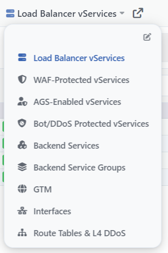 The Category List
By clicking the Edit Tabs button at the top right of the list, the category list passes to the editing view.
The button on the right of the category name opens, in the categories that have a listing screen, the listing screen of the open category on the main screen. The rest of the toolbar (Search, Filter, Settings, Collapse) and the other parts of the screen are explained on every category's own page; for an example see Load Balancer vServices.
Edit Tabs
In the Edit Tabs view the category list of the panel is arranged: the categories are reordered, added, changed or deleted. The changes made are not applied to the panel until they are saved with Save; Reset to Defaults, on the other hand, is applied the moment it is confirmed.
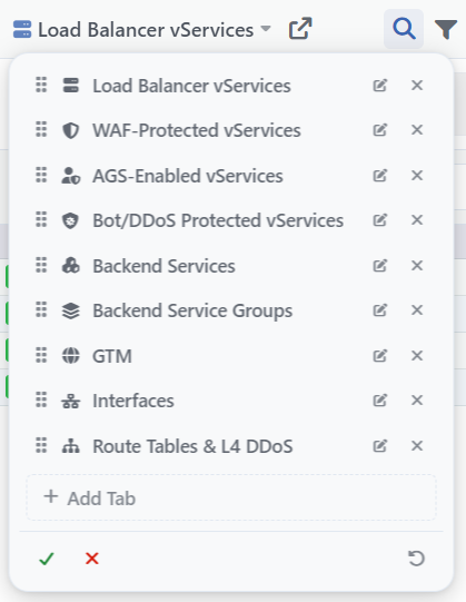 The Edit Tabs View
In every row there are the icon and the name of the category. If the object the category shows no longer exists (e.g. a category belonging to a deleted DNS service), a warning icon with the This tab's target no longer exists tooltip is displayed in the row.
Row Controls
INFO
The Drag Handle
By holding and dragging the handle on the left of the row, the place of the category in the list is changed.
INFO
Edit
By clicking the Edit button, the Edit Tab window that carries the same fields as the Add Tab window opens; the type or the custom name of the category is changed. When the type is changed, the category starts with the default view settings of the new type.
INFO
Delete
By clicking the Delete button, the category is removed from the list. When a single category remains in the list, this category is not deleted.
List Controls
INFO
Add Tab
By clicking the + Add Tab button, the Add Tab window opens; the category added is placed at the end of the list.
INFO
Discard Changes
By clicking the Discard changes button, the editing view is exited without the changes being saved. If a change has been made, the "Discard tab changes?" confirmation question is displayed first.
INFO
Reset to Defaults
By clicking the Reset to Defaults button, after the "Reset tabs to defaults?" confirmation question the category list is returned to the default nine categories without Save being required, the editing view closes and the first category opens.
The Add Tab Window
In the Add Tab window the type and, optionally, the name of the category to be added to the panel are selected.
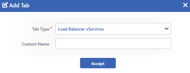 The Add Tab Window
INFO
Tab Type Required
The type of the category to be added is selected. The same type can be added to the list more than once; every copy stores its own filters and view settings separately. The options:
| Tab Type | Content |
|---|---|
| Load Balancer vServices | The Load Balancer vServices category. |
| WAF-Protected vServices | The WAF-Protected vServices category. |
| AGS-Enabled vServices | The AGS-Enabled vServices category. |
| Bot/DDoS Protected vServices | The Bot/DDoS Protected vServices category. |
| Backend Services | The Backend Services category. |
| Backend Service Groups | The Backend Service Groups category. |
| GTM | The GTM category. |
GTM Domains — <service> | The domain names of the selected DNS service. A separate option is listed for every DNS service. |
GTM Records — <service> | All the records of the selected DNS service. A separate option is listed for every DNS service. |
GTM Records — <service> / <domain name> | The records of a single domain name in the selected DNS service. A separate option is listed for every domain name. |
| Interfaces | The Interfaces category. |
| Route Tables & L4 DDoS | The Route Tables & L4 DDoS category. |
The list is limited to the types for which the user has authorization. In the setups that support vDevice, a separate option belonging to every vDevice (<type> - <vDevice>) is also listed for Interfaces and Route Tables & L4 DDoS.
INFO
Custom Name
The name of the category to be displayed on the panel is entered. When it is left empty, the category is displayed with the name of the type selected in the Tab Type field. It is used in order to distinguish them when more than one category of the same type is added.
INFO
Accept
By clicking the Accept button, the category is added to the editing list. In order for the category to be applied to the panel, the Save button must be clicked in the Edit Tabs view.
Collapsing and Expanding the Panel
The Collapse button on the right of the toolbar collapses the panel. The collapsed panel turns into a narrow icon strip: every category in the list is shown with an icon and the small status dots below it. When the icon is hovered over, the category name and the status distribution are displayed; when the icon is clicked, the panel expands again with that category.
The width of the panel is changed by dragging its right edge. The width and whether the panel is collapsed or open are stored per user; in new users the panel comes open.