Smarter by Design.Simpler for Business
Header Bar
What Is Header Bar?
Header Bar is the widget-based bar that is located at the very top of the TR7 management interface and on which the user sets up their own layout. It gathers items such as the user information, the language and theme selection, the page shortcuts, the clock, quick notes and live system or traffic metrics in a single strip that is seen on every screen.
All the items except the button on the left of the bar are widgets. The widgets are placed in the left or the right section of the bar, are ordered by dragging and are moved between the two sections. The layout is saved to the user account; the same layout also comes when the session is closed and opened, when it is entered from a different browser and on the peer device in a cluster setup.
10
Widget types
Control, shortcut and live metric widgets
10
Widget limit
At most 10 widgets in total in the left and the right section
Live
Instant metric
CPU, memory, disk, network, vService and DNS traffic on every screen
Personal
Saved to the account
Every user sets up, hides or resets their own layout
Why Is Header Bar Important?
Navigating the menu every time for the operations that are repeated frequently in the management interface (going to a certain page, checking the system load, changing the language or the theme) costs time. Header Bar makes these operations accessible whatever screen one is on.
Its widget-based and user-specific structure makes it possible for different roles to adapt the interface to their own priorities: a user who monitors places live CPU and traffic values on the bar, while a user who configures keeps only the shortcuts of the screens they use frequently.
The Default Header Bar
 The Default Header Bar
Header Bar comes with the layout below on first use and after Reset Header Bar:
| Section | Widget | On the screen | Function |
|---|---|---|---|
| Left | User Info | The user icon, the user name and the user type (e.g. admin (Admin)) | Opens the account screen of the user. |
| Left | Menu Shortcut | The home icon and Home | Opens the Home & Dashboard screen. |
| Right | Language Selector | The translation icon and the language code (e.g. EN) | Changes the interface language. |
| Right | Theme Toggle | The theme icon and the theme name (e.g. Light) | Changes the interface theme. |
| Right | Logout Button | The logout icon | Closes the session. |
On narrow screens some widgets hide their texts and show only their icons; the details are in the Narrow Screen Behavior section.
The Header Options Menu
The button (Header Options) at the very left of the bar is not a widget; it is always seen while the bar is shown, and only in the edit mode is its place taken by the save and discard buttons. When it is clicked, it offers three operations:
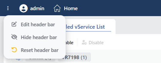 The Header Options Menu
| Operation | What it does |
|---|---|
| Edit Header Bar | Passes to the edit mode; in this mode the widgets are added, edited, ordered and removed. |
| Hide Header Bar | Hides the bar; a thin strip remains at the very top. When the strip is hovered over, the text Show Header Bar appears, and when it is clicked, the bar opens again. |
| Reset Header Bar | After the "Are you sure you want to reset the header bar to its default configuration? All customizations will be lost." confirmation, it returns the bar to the default layout and makes it visible. |
The difference between hiding and removing completely
Hide Header Bar reduces the bar to a thin strip and, when the strip is clicked, the bar comes back. In order to remove the bar completely together with its strip, the Header Bar preference in the My Preferences tab on the account screen of the user is used. The preference has three options: Show (the bar is visible), Hide (a thin strip) and Remove (the bar and the strip are not visible). A removed bar is brought back from this preference or with the preference reset operations on the same screen.
How Is Header Bar Customized?
1
Step 1 The edit mode is entered
Edit Header Bar is selected from the menu on the left of the bar. At the very left of the bar the save and discard buttons, next to every widget the editing controls, and at the end of the left section and at the beginning of the right section one add button each are seen.
 The Edit Mode
2
Step 2 The add window is opened
The button in the section to which the widget will be added is clicked; the Add Widget to Header window opens.
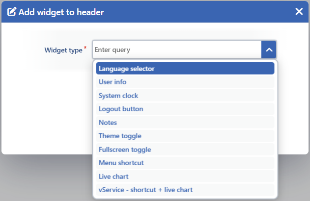 The Add Widget to Header Window
3
Step 3 The widget type and the setting are selected
The widget type is selected from the Widget Type list. If the selected type requires a setting (System Clock, Menu Shortcut, Live Chart, vService - Shortcut + Live Chart), a second required field is added to the form: Clock Format, Menu Item or Chart. The field comes filled with the first option of the list.
4
Step 4 The widget is added and positioned
By clicking the Accept button, the widget is added to the end of the selected section. The widget is moved to the desired place in the same section or in the other section by being dragged from the handle on its left.
5
Step 5 The changes are saved
With the (Save Changes) button at the very left of the bar, the changes are saved and the edit mode is exited.
The controls in the edit mode:
| Control | What it does |
|---|---|
| Save Changes | Saves the changes and exits the edit mode. |
| Discard Changes | If no change has been made, it exits directly; if a change has been made, it undoes the changes after the "Are you sure you want to discard all changes? Your modifications will not be saved." confirmation. |
| Handle | Orders the widget by dragging it or moves it to the other section. |
| Edit Widget | Opens the add window in order to change the type or the setting of the widget. The second field comes not with the current selection but with the first option of the list; the value to be preserved is selected again. |
| Remove Widget | Removes the widget from the bar without asking for confirmation. |
| Add button | Opens the Add Widget to Header window in order to add a new widget to the section. |
Limits
- There are at most 10 widgets in total on the bar; the widgets that are not displayed (the ones in the Unavailable Widget state) are included in this number as well. When the limit is reached, the warning "Maximum number of widgets reached (10). Please remove some widgets before adding new ones." is seen.
- Language Selector, User Info, Logout Button, Notes, Theme Toggle and Fullscreen Toggle are added to the bar only once; when they are wanted to be added a second time, the warning "<Widget name> is already added. This widget can only be added once." is seen. The other types (the clock format, the shortcut, the chart) can be added more than once.
A draft until it is saved
In the edit mode the widgets cannot be clicked; the Live Chart and vService - Shortcut + Live Chart widgets show only their icons and titles instead of a live value; the changes made are a draft until they are saved with . When the page is refreshed, the edit mode is exited. If the target of a widget is no longer accessible (e.g. a screen whose authorization has been removed or a deleted vService), the widget is not displayed in the normal mode; in the edit mode it is seen as Unavailable Widget and can be removed. When the record format of the bar changes with a version update, the saved layout returns to the default layout.
Adding a Shortcut from the Page Tab
When the tab above an open configuration screen that shows the location path is right-clicked, a menu opens for that screen:
| Operation | What it does |
|---|---|
| Add to Header Bar | Adds the Menu Shortcut widget of the screen to the left section of the bar and saves it. It is seen if the screen is not on the bar. |
| Remove from Header Bar | Removes the shortcut of the screen from the bar. It is seen if the screen is on the bar. |
While Header Bar is in the edit mode, the operation made from this menu is not applied.
The Widget Catalog
In the Widget Type list in the Add Widget to Header window there are 10 widget types.
INFO
Language Selector Single instance
Changes the interface language. On the bar the translation icon and the current language code (e.g. EN) are seen; when it is clicked, the language list (English, Türkçe) opens and the selection is applied without the page being refreshed. The selection is saved to the user account; if the user has not selected a language yet, the default language on the Localization screen is used.
INFO
User Info Single instance
Shows the user icon, the user name and, in parentheses, the user type (e.g. admin (Admin); in a read-only user the type is written as (Read-only User)). When it is clicked, the account screen of the user opens; the personal preferences are in the My Preferences tab of this screen.
INFO
System Clock Setting: Clock Format
Shows the date and the time on the bar, updating them every second; the clock is synchronized with the clock of the device. When it is hovered over, the System Date tooltip shows the full date. The Clock Format setting determines both the display and the time zone:
| Display | Format | Local Time Zone | Server Time Zone |
|---|---|---|---|
| Date and time (with seconds) | DD.MM.YYYY HH:mm:ss | ✓ | ✓ |
| Date and time | DD.MM.YYYY HH:mm | ✓ | ✓ |
| Time (with seconds) | HH:mm:ss | ✓ | ✓ |
| Time | HH:mm | ✓ | ✓ |
Local Time Zone uses the time zone of the browser and Server Time Zone the time zone defined on the NTP Time Sync screen; in the server time zone a difference such as GMT+03:00 is added to the end of the format.
INFO
Logout Button Single instance
It is seen only as the logout icon (tooltip: Logout). When it is clicked, the "Are you sure you want to logout?" confirmation is asked; when Yes is selected, the session is closed and the login screen is returned to.
INFO
Notes Single instance
It is a user-specific quick notepad. On the bar the note icon is seen; if there is a saved note, a green dot appears at the corner of the icon. When it is clicked, the Notes window opens: what is written in the text field with the Quick notes... placeholder is saved by itself a short time after the writing stops and the Saved indicator appears; below the field there is the character count (<n> chars). The text field is enlarged vertically by being dragged from its corner. The notes are saved to the user account.
INFO
Theme Toggle Single instance
Changes the interface theme. On the bar the icon and the name of the current theme are seen; when it is clicked, the theme list opens and the selection is applied without the page being refreshed. In the list there are 30 ready themes: Light, Dark, Graphite, Glass Light, Glass Dark, Glass Steel, Glass Gold, Ember, Admiral, Platinum, Brass, Amethyst, Iris, Cobalt, Hematite, Garden, Cream, Regiment, Aegean Coral, Garnet, Basalt, Onyx, Plasma, Midnight, Forest, Umber, Crimson, Midas, Nord and Gruvbox. The custom themes created by the user (at most 20) are listed after the ready themes.
While a theme is being previewed, Preview is written on the bar and no selection is made from the list until the preview ends. The selected theme is saved to the user account. If a theme has not been selected yet, on first opening Light or Dark is used according to the light or dark theme preference of the operating system.
INFO
Fullscreen Toggle Single instance
Takes the browser window to full screen. On the bar the expand icon is seen (tooltip: Fullscreen); while in full screen the icon turns into the collapse icon (tooltip: Exit Fullscreen) and, when it is clicked, the full screen is exited. When the full screen is exited with Esc or F11, the icon is updated as well.
INFO
Menu Shortcut Setting: Menu Item
Makes it possible to go to a selected configuration screen with a single click. On the bar the icon and the name of the screen in the menu are seen; while on that screen the widget is highlighted. The Menu Item list contains all the screens that can be opened in the Configuration Menu tabs the user can see (except the group cards that list subscreens) and the Home screen. The same shortcut is also added by right-clicking the tab of an open screen (Adding a Shortcut from the Page Tab).
INFO
Live Chart Setting: Chart
Shows the instant value of the selected system, network, vService or DNS metric on the bar in the form icon · Title: value and updates it continuously; when it is clicked, it does not open a screen. In the Chart list there are the metrics below according to the authorization of the user:
| Group | List text | The value shown | Visibility condition |
|---|---|---|---|
| System | Uptime | The uptime (e.g. 3d 4h 12m 5s) | Settings authorization |
| System | CPU | The CPU usage (%) | Settings authorization |
| System | Load | The 1, 5 and 15 minute load average | Settings authorization |
| System | CPU Temp | The CPU temperature (°C) | Settings authorization; it is not listed on virtual machines |
| System | Memory | The memory usage (%) | Settings authorization |
| System | Disks | The usage ratios of all the disks | Settings authorization |
| System | Root disk, Service disk, Data disk | The usage ratio of a single disk (a separate option per disk) | Settings authorization |
| vService | All vServices - Req/s | The requests per second on all the vServices | Load Balancer authorization |
| vService | All vServices - Concurrent Sessions | The concurrent sessions on all the vServices | Load Balancer authorization |
| vService | All vServices - Throughput | The data flow rate on all the vServices | Load Balancer authorization |
| vService | All vServices - Bandwidth | The incoming and outgoing bandwidth on all the vServices | Load Balancer authorization |
| Network | Network | The total incoming and outgoing traffic | Network authorization |
| Network | Connections | The active, established and total TCP connections | Network authorization |
| Network | TCP Issues | The number of TCP issues | Network authorization |
| DNS | All DNS Services - Queries/s | The queries per second on all the DNS services | GTM authorization |
| DNS | All DNS Services - Bandwidth | The DNS response traffic | GTM authorization |
| DNS | All DNS Services - Latency | The DNS response latency | GTM authorization |
In a cluster setup the value is calculated from the data of the two devices.
INFO
vService - Shortcut + Live Chart Setting: Chart
Shows the live metric of a vService and at the same time provides a shortcut to that vService. In the Chart list the Req/s, Concurrent Sessions, Throughput and Bandwidth metrics are present, in the users who have Load Balancer authorization, both for the All vServices total and separately for every vService on the device (e.g. support.tr7.com - Req/s); in the users who have WAF authorization, a second Req/s option that shows the same number of requests is also listed for every vService.
At the beginning of the widget added for a single vService there is the status circle of the vService (in a cluster setup the left half is this device and the right half the peer device) and, when it is clicked, the Dashboard screen of the vService opens. In the All vServices options there is no status circle and, when the widget is clicked, it does not open a screen.
Narrow Screen Behavior
When the widgets do not fit in a section, scroll arrows appear at the edges of that section; while an arrow is held down, the section scrolls, and when an arrow is double-clicked, it jumps to the end of the section in that direction; the section is also scrolled with the mouse wheel and the touchpad. As the screen width narrows, the widgets hide their texts:
| Screen width | Effect |
|---|---|
| 1400 px and below | User Info hides the user type; the text of System Clock becomes smaller. |
| 1200 px and below | User Info hides the user name, Theme Toggle the theme name and Menu Shortcut the screen name, and only the icon remains; Live Chart and vService - Shortcut + Live Chart hide their icons (the status circle of the vService widget remains); the text of System Clock becomes a little smaller. |
Language Selector, Logout Button, Notes and Fullscreen Toggle look the same at every width.