
Smarter by Design.Simpler for Business
Login Forms
What Are Login Forms?
Login Forms are the profiles in which the forms that are shown to the user in the AGS access flow and that collect the credentials or other inputs are defined. The form consists of its title, its description and ordered fields. Each field has a type (text, password, e-mail, number, select list, file, multi-line text, date/time, checkbox, hidden field, submit button, information text, divider, HTML content or button group); the label, the placeholder and the help text are given as fixed text or multilingually with a Dictionaries (Multilingual) key. The fields are limited with validation rules, their values are assigned to the user fields in the session and they are shown and hidden according to the HTTP request conditions.
The form is added to the access flow of the vService with AGS enabled as a form step and provides input to the authentication step in the flow; the entered values are used in the following steps of the flow with the %AGS_USER_INPUT(field name) variables. Two built-in forms come with TR7 (Basic Login: the username + the password, Email Login: the e-mail + the password); the flow of a new vService starts with Basic Login. The built-in forms do not appear in the list of this screen, they are selected directly in the selector in the flow editor.
18
Field Type
Text, Password, Email, Number, Single/Multiple Select, File, Multi-line Text, Date, Time, Date and Time, Checkbox, Hidden Field, Submit Button, Information Text, Divider, HTML Content, Button Group
4
Text Types
Static · Dictionary · Default · No Text; for the title, label, placeholder, help and button texts
8
Validation Pattern
None, Email format, Domain Name, IP Address, Port Number, URL Address, Alphanumeric, Numbers Only
Assign
Assignment to User Fields
The field value is copied to the selected session user fields
Condition
Conditional Visibility
The fields and the buttons are shown according to the HTTP request conditions
2
Built-in Forms
Basic Login · Email Login (they do not appear in the list, they are selected in the flow)
How does it work?
- The form is defined on this screen: the fields are added card by card, and on each card the type, the field name, the label and, if necessary, the validation, assignment and condition settings are configured.
- The form is selected as the form step in the access flow of the vService with AGS enabled; the user is directed to the
/formpage and the form is served with the Page Templates appearance of the vService. - When the user submits the form, the field values pass to the flow; the authentication step uses them with
%AGS_USER_INPUT(field name), and the values marked with Assign to User Fields are copied to the session user fields. - The Static texts and the Dictionary keys are written into the page over the user dictionary of the vService; the conditional fields are shown or hidden according to the properties of the request.
Built-in Forms
| Form | Fields | Assignments |
|---|---|---|
| Basic Login (the starting point of the flow of a new vService) | username (Text, required), password (Password, required), a Submit Button (the dictionary key _common.signIn, Primary, Submit Full Form) | username → User Id, Username |
| Email Login | email (Email, required), password (Password, required), the same submit button | email → User Id, Email, Username |
Since the built-in forms are not in the list, they are not edited or deleted from this screen; for a different form a new profile is created on this screen.
Operational Best Practices
- The field names compatible with the provider. The authentication providers expect
%AGS_USER_INPUT(username)and%AGS_USER_INPUT(password)by default; when a different Field Name is given, the expressions in the provider profile must be updated as well. - One submit button. There must be at least one Submit Button or Button Group in the form; otherwise the user cannot submit the form.
- A dictionary for multilingual texts. When the Dictionary type is selected in the label and help texts and a key is given, the text comes according to the language in the dictionary of the vService; in single-language installations Static is sufficient.
- The user field assignments. If the form value has to be used in the session (e.g. the e-mail), the related user field must be selected with Assign to User Fields; the provider mapping can overwrite this value.
- Conditional fields in moderation. The field and button conditions are evaluated according to the properties of the request (the header, the address, the source); the conditional fields must be within the first 31 fields of the form and the conditional buttons within the first 31 buttons of the group.
- The flows before deleting. The delete confirmation does not show the usage locations; the vServices that use the form must be checked on the Used in tab in the preview.
How to Add?
A new Login Forms profile is added through the TR7 web management interface with the following steps:
- The Configuration Menu is opened by clicking the TR7 logo at the bottom left.
- The AGS → Pages & Language → Login Forms → Add steps are followed.
- A unique and descriptive name is entered for the profile.
- The username and password cards that come ready are edited or new field cards are added.
- The profile is added by clicking the
Addbutton.
TIP
Reaching the page via quick search
Instead of navigating the menu step by step, the related page is reached directly by using the search bar in the bottom left corner of the screen. The search bar opens with the Alt + T shortcut on Windows and Opt + T on macOS; typing the name of the feature being searched for is then sufficient.
The created profile is used in the Form Profile selector of the form step in the access flow of the vServices with AGS enabled.
Login Forms Listing Screen
The list of all Login Forms profiles that are added on the TR7 device is reached by following the AGS → Pages & Language → Login Forms path. Profile adding, editing and deleting operations are performed on this screen. The built-in forms are not listed.
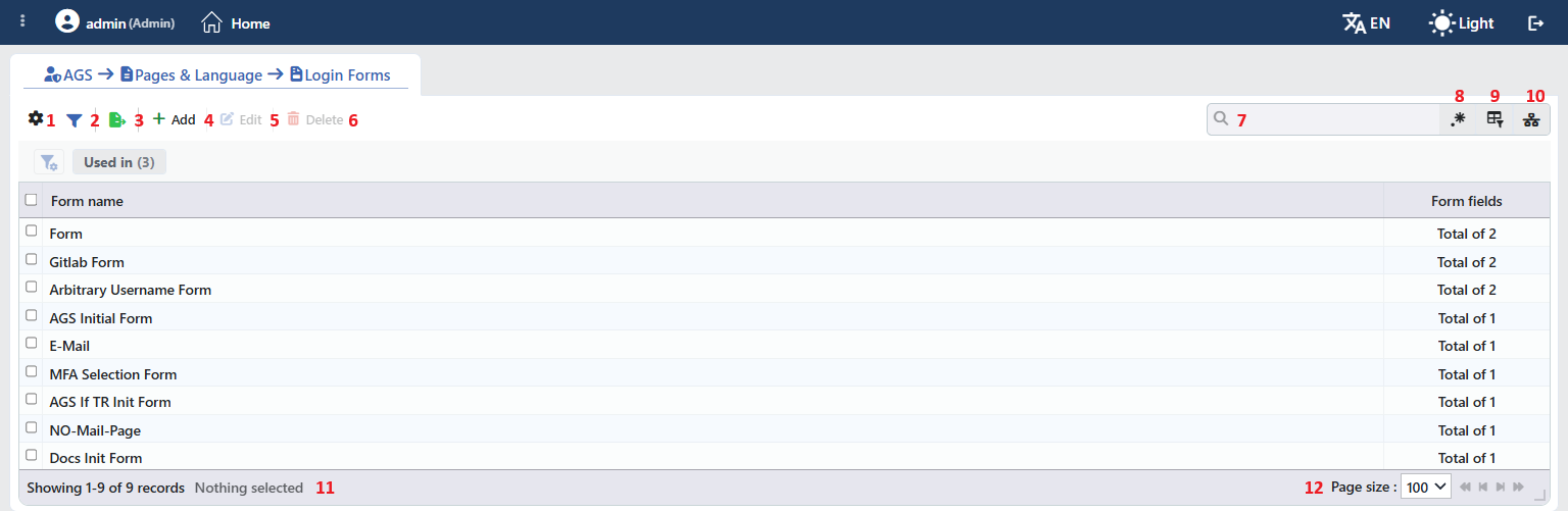 Login Forms Profiles Listing Form
The table opens with the following columns by default:
| Column | Description |
|---|---|
| Form Name | The name of the profile. |
| Form Fields | The number of fields in the form (Total of N). |
There is no column that is hidden by default. The table is not sorted when it opens; when a column header is clicked, first a descending and then an ascending sort is applied, and on the third click the sort is removed.
The items in the toolbar are arranged from left to right in the following order; the last two items (Page Information and Page Size) are located in the information strip below the table.
Columns
Which columns are shown in the table is selected; both of the columns come on. In the same panel the columns are reordered by dragging and the alignment is selected per column; the row height is fitted to the page with the Fit rows to the page button and the column layout is returned to the default with the Reset button. When the width badge next to a manually widened column is clicked, the column returns to the automatic width.
Filter
The Filter button is used to filter the profiles shown in the list according to certain criteria. There is a single card in the filter strip; the number next to the card name shows how many different values are found for that card in the profiles in the list:
| Card | What it filters |
|---|---|
| Used in | The vServices that use the profiles and the Unused Entries value, which lists the profiles that are not used anywhere. |
Export
The table is exported as Excel, CSV or PDF by clicking the Export button. In the window that opens, the Filename, Format and Data Source, together with the Columns to be exported, are determined; the remaining fields are displayed according to the format: CSV Separator for CSV, Excel Sheet Name for Excel, and Page Orientation and Page Size for PDF.
Add
By clicking the Add button, the form for creating a new profile opens in the Add tab.
Edit
By clicking the Edit button, the edit form of the selected profile opens in the Edit tab. The button becomes enabled only when a single profile is selected.
The edit form is the same as the add form; all the fields and the cards including the name are changed and the button at the bottom of the form carries the name Edit. The change is saved without asking for confirmation and the configuration of the vServices that use the profile is applied again.
Delete
When one or more profiles are selected and the Delete button is clicked, the related profiles are deleted. Before deleting, the "Are you sure?" confirmation is asked for.
WARNING
A profile that is in use can also be deleted and the confirmation window does not show the usage locations.
The flow step that uses the form points to a profile that does not exist and the configuration is produced with an empty field list; the flow must be edited and another form must be selected. The delete operation is written to the user operation record.
Search
Used to search all information in the table.
RegExp Search
Used to search all the information in the table with a regular expression (RegExp). While the column-based search or the usage filter is active, this button is hidden.
Column Based Search
Used to perform a column-based search on the information in the table.
Usage Filter
Used to filter to which vServices the profiles are bound. While the filter is active, a selector takes the place of the search box; when the icon is clicked again, the search box returns.
Page Information
Contains information about the total number of defined profiles and the number of profiles displayed in the list: Showing N-M of T records and the number of selected profiles (N selected, or Nothing selected when there is no selection).
Page Size
The maximum number of profiles to be displayed on the page is selected. On this screen the default is 100; the options are 5, 10, 20, 50, 100, 200, 500 and All.
Right-Click Menu
When a row is right-clicked, a menu with the profile's name in its title opens. Both operations in the menu apply only to the right-clicked profile; a selection made in the list does not affect the menu.
| Operation | What it does |
|---|---|
| Edit | Opens the editing form of the profile in the Edit tab; it is the same as the form opened by the Edit button in the toolbar. |
| Delete | Deletes the right-clicked profile; the same confirmation question as the deletion in the toolbar is displayed. |
Preview of the Selected Profile
When a row in the list is clicked, the preview of the profile opens on the right of the screen; when the selected row is clicked again, the panel closes. The header contains the form icon, the name of the profile and the Form subtitle, and the single operation is at the top right.
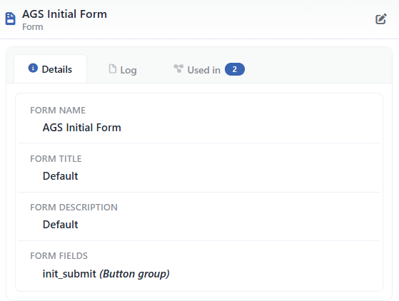 Preview of the Selected Profile
| Operation | What it does |
|---|---|
| Edit | Opens the editing form of the profile in the Edit tab. |
There are three tabs in the panel; Used in is displayed only if the profile is used on at least one vService:
Details
Lists the settings of the profile row by row (the table below).
Log
Lists the user operations on the profile (adding, editing, deleting) as a timeline.
Used in
Lists the vServices that use the profile. The badge next to the tab name shows the usage count.
The rows in the Details tab are as follows, in order:
| Row | Description | Visibility condition |
|---|---|---|
| Form Name | The name of the profile. | Always |
| Form Title | The text itself in the Static type, Dictionary: key in the Dictionary type, and the type name in the other types (e.g. Default). | If it is defined |
| Form Description | In the same form as Form Title. | If it is defined |
| Form Fields | field name (Type) for each field (e.g. init_submit (Button Group)); the decorative fields that have no name only with the type. | If there is at least one field |
Profile Add Form
A new Login Forms profile is added on the TR7 device by following the AGS → Pages & Language → Login Forms → Add steps. There are four fields at the top level; the form fields are edited in the cards in the Form Fields list. While there is an error in the form (the card errors are displayed as Correct Invalid Inputs at the top level), the Add button is inactive.
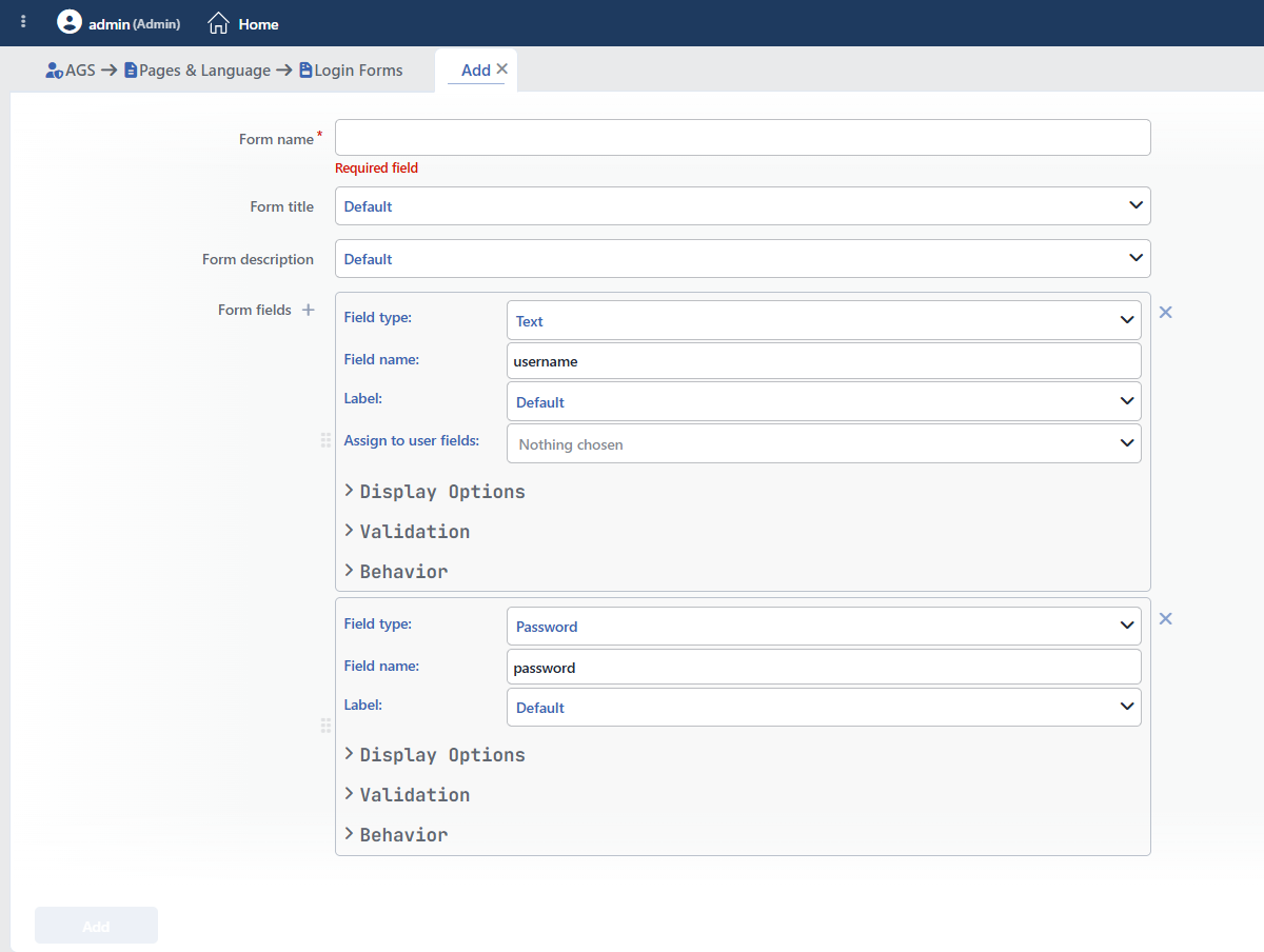 Login Forms Profile Add Form
Top Level Fields
INFO
Form Name Required
The name of the profile; it identifies the profile in the selection in the flow editor and in the logs. The name must be unique on the device; a second profile with the same name is not saved and the Name is used warning is displayed. When it is left empty, the Required field warning is displayed.
INFO
Form Title Default: Default
The title shown at the top of the form. The text type is selected from the drop-down list; according to the selected type a text box or a key box is displayed next to it. When the type is changed, the entered content is reset:
| Option | Meaning |
|---|---|
| Static | A fixed text is entered; a smart variable is added with the ƒx icon (Enter text content...). The text is displayed the same in every language. |
| Dictionary | A dictionary key is entered (Enter dictionary key (e.g., _ags.title)). The text comes from the value defined with this key in the dictionary selected for the vService, according to the language of the user; for the details and an example see Example Usage. |
| Default | The built-in text of AGS is used. |
| No Text | The title is not displayed. |
INFO
Form Description Default: Default
The description text shown under the title. The text type is selected from the drop-down list:
| Option | Meaning |
|---|---|
| Static | A fixed text is entered; a smart variable is added with the ƒx icon. The text is displayed the same in every language. |
| Dictionary | A dictionary key is entered; the text comes from the dictionary of the vService according to the language of the user. |
| Default | The built-in text of AGS is used. |
| No Text | The description is not displayed. |
INFO
Form Fields
The list of the field cards. A new card is added with the + icon next to the Form Fields label and comes as a field of the Text type whose name is empty. In a new form two cards come ready: username (Text) and password (Password). The cards are ordered by dragging from the handle on the left and are deleted with the × icon on the right; the last card is not deleted, at least one field is present in the form.
The Field Card
Each card consists of four sections: the basic section without a heading is always open; the Display Options, Validation and Behavior sections come collapsed and are opened by clicking their headings. The displayed fields vary according to the selected Field Type.
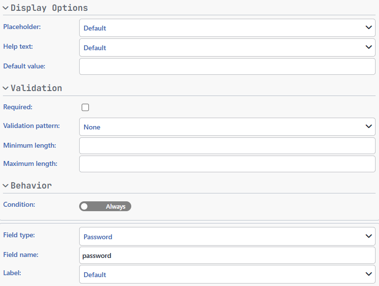 The Open Sections of the Field Card
INFO
Field Type Required Default: Text
The type of the field is selected:
| Option | Meaning |
|---|---|
| Text | A single-line text input (e.g. the username). |
| Password | A password field that hides the entered characters; the value is kept encrypted in the session. |
| An e-mail address input. | |
| Number | A number input; it accepts a decimal value. |
| Single Select | A single value is selected from the option list. |
| Multiple Select | More than one value is selected from the option list. |
| File | A file upload field. |
| Multi-Line Text | A multi-line text input. |
| Date | A date selection. |
| Time | A time selection. |
| Date and Time | A date and time selection. |
| Checkbox | A checkbox (e.g. accepting the terms of use). |
| Hidden Field | A field that is not visible to the user and sends a fixed value together with the form. |
| Submit Button | The button that submits the form. |
| Information Text | Shows an information text in the form; it collects no value. |
| Divider | Puts a divider line between the fields; it carries an optional text. |
| HTML Content | Places HTML content into the form. |
| Button Group | Several buttons that each send a separate value (e.g. the MFA method selection). |
INFO
Field Name Required
The name of the field used in the flow; the value is read in the following steps with %AGS_USER_INPUT(field name). It has to start with a letter and contain letters, digits and underscores. It is not present in the Divider, Information Text and HTML Content types.
INFO
Label Default: Default
The label of the field. It is not present in the Hidden Field, Divider, Information Text and HTML Content types. The text type is selected from the drop-down list:
| Option | Meaning |
|---|---|
| Static | A fixed text is entered; a smart variable is added with the ƒx icon. The text is displayed the same in every language. |
| Dictionary | A dictionary key is entered; the text comes from the dictionary of the vService according to the language of the user. |
| Default | The built-in label of AGS for the field type is used. |
| No Text | The label is not displayed. |
INFO
Assign to User Fields
The session user fields to which the field value is copied are selected in multiples; while it is empty, Nothing chosen is displayed. It is displayed in the Text, Email, Number, Single Select and Hidden Field types.
The user fields that can be selected are in the list in the following order; only these built-in fields are in the list, the custom attributes defined with the provider mapping cannot be selected:
| Option | Meaning |
|---|---|
| User Id | The unique id of the user in the session. |
| Username | The username. |
| The e-mail address. | |
| Display Name | The full name shown on the pages. |
| First Name | The first name. |
| Last Name | The last name. |
| Phone | The phone number (e.g. for MFA over SMS). |
| Picture | The profile picture. |
| Locale | The language and region preference of the user. |
| Timezone | The time zone of the user. |
| Company | The company name. |
| Department | The department. |
| Title | The job title. |
| Employee Id | The employee number. |
| Groups | The groups the user is a member of. |
Display Options
INFO
Placeholder Default: Default
The placeholder text shown inside the field while it is empty; it is present in the Text, Password, Email, Multi-Line Text, Number and date/time types. The text type is selected from the drop-down list:
| Option | Meaning |
|---|---|
| Static | A fixed text is entered; a smart variable is added with the ƒx icon. The text is displayed the same in every language. |
| Dictionary | A dictionary key is entered; the text comes from the dictionary of the vService according to the language of the user. |
| Default | The built-in placeholder of AGS for the field type is used. |
| No Text | The placeholder is not displayed. |
INFO
Help Text Default: Default
The help text shown under the field. It is not present in the Hidden Field, Divider, Information Text and HTML Content types. The text type is selected from the drop-down list:
| Option | Meaning |
|---|---|
| Static | A fixed text is entered; a smart variable is added with the ƒx icon. The text is displayed the same in every language. |
| Dictionary | A dictionary key is entered; the text comes from the dictionary of the vService according to the language of the user. |
| Default | The built-in text of AGS is used. |
| No Text | The help text is not displayed. |
INFO
Default Value
The initial value of the field. It is not present in the button, divider, information text, HTML content and hidden field types.
INFO
Rows Default: 4
The height of the field in the Multi-Line Text type; a value between 2 and 20 rows is entered.
Validation
INFO
Required Default: off
When it is checked, the form is not submitted with the field left empty. It is not present in the button, divider, information text, HTML content and hidden field types.
INFO
Validation Pattern Default: None
Only in the Text type; the format the entered value has to comply with is selected:
| Option | Meaning |
|---|---|
| None | No format check is performed. |
| Email Format | The value has to be in the e-mail address format. |
| Domain Name | The value has to be in the domain name format. |
| IP Address | The value has to be an IP address. |
| Port Number | The value has to be a valid port number. |
| URL Address | The value has to be in the URL format. |
| Alphanumeric | The value has to contain only letters and digits. |
| Numbers Only | The value has to consist only of digits. |
INFO
Minimum Length
How many characters the entered value is at least in the Text, Password and Multi-Line Text types; a value of 0 and above is entered.
INFO
Maximum Length
How many characters the entered value is at most in the Text, Password and Multi-Line Text types; a value of 1 and above is entered.
INFO
Minimum Value
The lower limit of the entered value in the Number type; it accepts a decimal value.
INFO
Maximum Value
The upper limit of the entered value in the Number type; it accepts a decimal value.
INFO
Maximum File Size (bytes)
The largest size in bytes of the file that can be uploaded in the File type; a value of 1 and above is entered.
Behavior
INFO
Condition Default: Always
The visibility condition of the field. While the switch is in the Always position, the field is always shown; when it is moved to the Select position, the HTTP request condition builder opens and the field is shown only on the requests that match the condition. The conditions are selected from the HTTP conditions defined on the Conditions screen or a new condition is added from the builder.
Type-Specific Fields
INFO
Options Required (Single/Multiple select)
The option table in the Single Select and Multiple Select types; a row is added with the + icon next to the label and at least one row is present.
Value Required
The value that is sent when the option is selected.
Display Text
The text of the option shown to the user; on a new row it comes in the Static type and empty. It is entered in the Static, Dictionary, Default or No Text type.
INFO
Submit Button
The fields specific to the Submit Button type:
Button Text Required
The text on the button; it is entered in the Static, Dictionary, Default or No Text type.
Button Style Default: Primary
The color style of the button is selected in the Display Options section:
| Option | Meaning |
|---|---|
| Primary | The main action style (the brand color). |
| Secondary | The secondary action style. |
| Danger | The style of a dangerous or irreversible action. |
| Success | The confirmation style. |
Button Icon
The icon of the button in the Display Options section; a PNG, ICO, JPEG or GIF file or an image address is accepted. The uploaded image is cropped from the center so that it is square, is reduced to the 64×64 pixel limit and is compressed below 50 KB.
Submit Behavior Default: Submit Full Form
The data to be sent when the button is clicked is selected in the Behavior section:
| Option | Meaning |
|---|---|
| Submit Full Form | All the fields in the form are sent. |
| Merge with Form Data | The form fields are sent together with the fixed values in the Submit Data table. |
| Override Form Data | Only the values in the Submit Data table are sent instead of the form fields. |
Submit Data
Displayed when Merge with Form Data or Override Form Data is selected; Field Name and Field Value pairs are added with the + icon next to the label.
INFO
Button Group
The fields specific to the Button Group type:
Layout Default: Horizontal
The arrangement of the buttons is selected in the Display Options section:
| Option | Meaning |
|---|---|
| Horizontal | The buttons are arranged side by side. |
| Vertical | The buttons are arranged one under the other. |
| Grid | The buttons are arranged in a grid; a column number between 1 and 6 is entered in the Columns field (the default 2). |
Buttons Required
The list of the button cards; they are added with the + icon next to the Buttons label. A newly added Button Group field comes without a button and the At least 1 must be selected warning is displayed; at least one button must be added. The following fields are on each card:
| Field | Meaning |
|---|---|
| Button Value | Required; the value that is sent when the button is clicked. |
| Condition | An optional visibility condition; the button is shown only on the requests that match the HTTP conditions on the Conditions screen. |
| Button Text | Required; the button text (Static, Dictionary, Default or No Text). |
| Button Icon | The icon of the button. |
| Button Style | Secondary (the default), Primary, Danger, Success or Custom. |
| Background Color | The background color of the button with the color picker when the Custom style is selected. |
| Text Color | The text color of the button with the color picker when the Custom style is selected. |
INFO
Information Text, Divider, HTML Content and Hidden Field
The fields specific to these types:
| Type | Field | Meaning |
|---|---|---|
| Information Text | Content (required) | The information text to be shown; it is entered in the Static, Dictionary, Default or No Text type. |
| Divider | Divider Text | The optional text on the divider line; it is entered with the same text types. |
| HTML Content | HTML Content (required) | The HTML content written into the plain text box. |
| Hidden Field | Hidden Value (required) | The fixed value sent together with the form. |
INFO
Add
The profile is added by clicking the Add button; the tab closes and the profile is displayed in the list.
Operating Mechanism
INFO
- Distribution. The forms are transferred to the access engines of the vServices with AGS enabled; after a change the configuration is applied again. The form step is served on the
formpage under the AGS root path of the vService (/ags-portal/formwith the default root path; the second form step in the same flow isform-2). - The texts. The title, description, label, placeholder, help, button, information text (Content) and divider text (Divider Text) of the Static type and the option texts are written into the user dictionary of the form step as a smart variable template; the Dictionary keys are resolved from the dictionary of the vService according to the language of the user.
- The conditions. The field and button conditions are evaluated per request in the vService configuration and their result is carried to the access engine (only if there is at least one conditional field); the showing of the fields accordingly is on the engine side.
- The session fields. The form fields are recorded as session fields (except the divider, the information text and the HTML content); the Password type is marked as encrypted.
- Cluster. The profiles are synchronized between the devices with the LB configuration.
- Logs. Adding, editing and deleting are monitored on the User Logs screen as the form object.
Scope and Limits
INFO
- Permission. The AGS screens depend on the Load Balancer permission area; for a user who does not have the permission the You don't have access to this page card is displayed instead of the page.
- The name is unique. A second profile carrying the same name is not saved.
- The built-in forms are not listed, they are not edited or deleted from this screen.
- License. The screen requires the AGS license.
- HTML Content is a plain text box; there is no preview or editor. There is no live preview of the form on the screen.
- The condition limit. The conditional fields have to be within the first 31 fields of the form and the conditional buttons within the first 31 buttons of the group.
- The field names have to be unique within the form; if the same name is used twice, the record is not completed and the Value must be unique, conflicts with '…' warning is given.
- Deleting does not perform a reference check; a profile in use is deleted as well.
Usage Locations
| Usage location | Field | Purpose |
|---|---|---|
| A vService with AGS enabled → Flowchart (edit mode) | The form step, the Form Profile selector | The login form to be shown to the user; the built-in forms are selected here as well |
| Authentication Providers | The %AGS_USER_INPUT(field name) expressions | The carrying of the form fields to the provider |
| Dictionaries (Multilingual) | The texts of the Dictionary type | The form texts coming multilingually |